The valknut is three interlocking triangles, and it carries serious weight. This is not a decorative Norse doodle. It’s a symbol tied directly to Odin, death, and the cycle of life, battle, and the afterlife. People get it because it means something, not because it looked cool on a Pinterest board.
If you’re thinking about this tattoo, you owe it to yourself to understand what you’re putting on your skin permanently. Here’s the real deal on what the valknut means, where it comes from, and how to get it done right.
What the Valknut Actually Means
The word valknut comes from Old Norse: ‘valr’ meaning the slain, and ‘knut’ meaning knot. Slain-knot. That’s it. The symbol is directly associated with Odin, the Norse god of death, war, wisdom, and fate. It appears on burial stones and funerary objects, marking the dead who fell in battle and were claimed by Odin for Valhalla.
For tattoo wearers today, the main meanings are death acceptance, warrior spirit, fate and destiny, and devotion to Norse paganism or the Asatru faith. Some people wear it as a memorial piece for fallen friends or family. Others wear it as a personal commitment to facing death without fear. It’s heavy symbolism, done right when you mean it.
The Real Historical Background
Three triangles, nine points, every line answers to Odin.
The valknut shows up in Viking Age artifacts from Scandinavia, most famously on the Tangelgarda stone from Gotland and several Oseberg ship burial items. These weren’t decorative patterns. They appeared alongside images of Odin, ravens, wolves, and warriors being sacrificed. The symbol marked sacred ground between the living and the dead.
There’s no surviving Old Norse text that names the symbol ‘valknut.’ That term is modern, coined by researchers. What we know for certain is the archaeological context: this symbol lived in death ritual and Odin worship. It’s not a generic Norse decoration. It has specific, documented spiritual weight behind it.
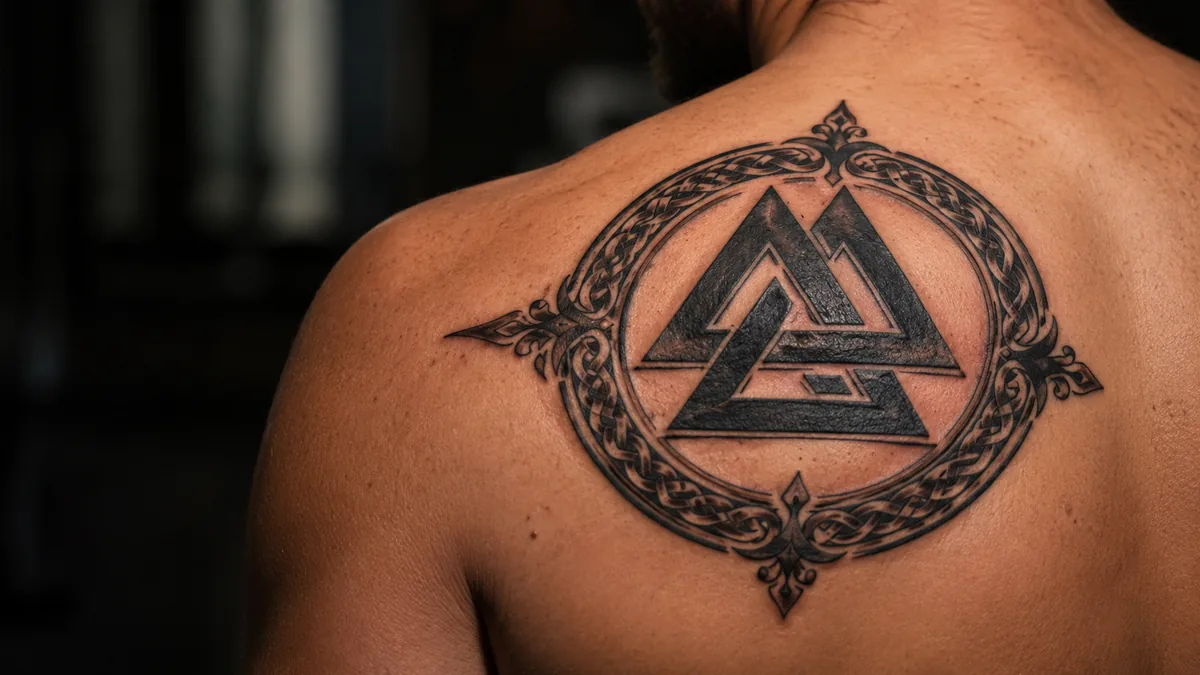
Unicursal vs. Borromean: Two Very Different Designs
There are two main valknut forms and they’re structurally different. The unicursal version is drawn as one continuous line that creates three interlocking triangles. The Borromean version has three separate triangles linked so that removing any one frees the others. Both read as the valknut at a glance, but they carry slightly different geometric energy.
The unicursal version tends to look more fluid and organic. The Borromean reads bolder and more architectural, especially scaled up. In terms of tattooing, the Borromean holds better at smaller sizes because the triangles have cleaner separation. The unicursal version needs a little more real estate or the line crossings can muddy up on healing. Know which one your artist is drawing before you sit.
Style Variations: From Fine Line to Blackwork
The valknut works across multiple tattoo styles. Fine line versions look clean and minimalist, great if you want something subtle. Geometric and blackwork treatments emphasize the angular structure and give it a modern edge. Traditional or neo-traditional styles add bold outlines with decorative shading, which holds for decades and reads from across the room without question.
Dotwork and stipple shading give it a textured, almost ancient look that fits the Norse context well. Some people integrate the valknut into larger Norse compositions with Yggdrasil, ravens, wolves, or runic text. Done right, those composite pieces are heavy hitters. Keep the composition tight and make sure the valknut stays the clear focal point if that’s your intent.
Black and Grey vs. Color
Most valknut tattoos are done in solid black. The geometry lends itself to crisp, clean black lines with minimal or no shading. That’s the most common execution and the most timeless. Solid black saturated triangles age beautifully on most skin tones and stay legible for years without touch-ups, especially in low-wear zones.
Color is less common but not wrong. Some people add dark red or a muted gold to lean into Norse warrior aesthetics. Blue-black shading works well for giving the symbol depth without muddying the lines. Avoid pastel or overly light fill colors. The geometric structure needs contrast to hold its shape over time. High saturation or solid black will serve you far better long-term.
Best Placements and How It Ages
The valknut is a compact geometric symbol, so it scales well from business card size to hand-sized. Forearm, upper arm, chest, and back are all solid placements for longevity. These are relatively low-wear zones compared to hands, fingers, or feet, where constant friction causes faster fading and requires more frequent touch-ups. The lines stay crispy longer when you keep it off the high-wear zones.
Ribs are a popular choice for the dramatic look, though that placement is spicy. Sternum and throat placements are also done, usually by folks deep into Norse spirituality who want it visible. For small versions, the wrist or behind the ear can work with a skilled artist who knows how to keep fine line geometric work from blowing out on delicate skin. Bold will hold, always.
Who Gets This Tattoo and How to Make It Personal
The valknut attracts a pretty specific crowd. Norse pagans and Asatru practitioners wear it as a devotional mark, the way Christians wear crosses. Veterans and military folks wear it as a nod to warrior identity and brotherhood. Others get it as a memorial piece or a reminder that death is part of life and nothing to run from. It’s not a fashion tattoo. The people who wear it usually have a reason.
To make it personal, think about what you’re pairing it with. Adding a name, a date, or runes gives it a specific story. Choosing the Borromean vs. unicursal form and being intentional about size and placement all communicate meaning. Talk to your artist about the context. A good tattooer will help you build a composition that’s yours, not just a flash sheet copy.
