Lettering tattoos are design work, not just typed words, and the biggest risk is making the letters too small to heal well.
Quick answer: Good lettering tattoos use readable fonts, enough spacing, clean placement, and a short phrase. Ask for healed lettering examples before booking.
Lettering Tattoo Guide style directions
A tattoo style is more than a look. It decides line weight, shading, color, artist fit, and how the piece will read years after the first photo.
| Direction | Best use | Watch out for |
|---|---|---|
| Fine script | Soft personal look | Can close up |
| Bold serif | Readable statement | Needs style fit |
| Handwriting | Personal source | Needs cleanup |
| Gothic letters | Strong visual style | Can get dense |
| Typewriter style | Clean nostalgia | Spacing matters |
How to make it work on real skin
The font you pick is the font you wear for life, choose it like it matters.
Lettering should be judged at real size. Zoomed-in stencil screenshots make tiny words look safer than they are.
The artist may need to adjust the original handwriting or font so it heals as a tattoo, not as a printout.
Lettering Tattoo Guide: Fonts, Size and Placement: artist fit and aging
This style depends on execution. Line weight, contrast, spacing, and the artist’s healed portfolio matter more than the label used on social media.
Ask what should be simplified for your skin, placement, and size. A good tattooer will protect the design from becoming too fragile.
- Check spelling, language, and date accuracy.
- View the stencil from normal distance.
- Keep the phrase short.
- Ask how the letters will age.
Mistakes to avoid
Do not use a font only because it looks delicate.
Do not place long text on a body curve without testing readability.
What makes this style work after the fresh photo
A good lettering tattoo guide tattoo is not just a surface look. It depends on line weight, contrast, spacing, artist fit, and how the design will settle after the skin stops looking glossy.
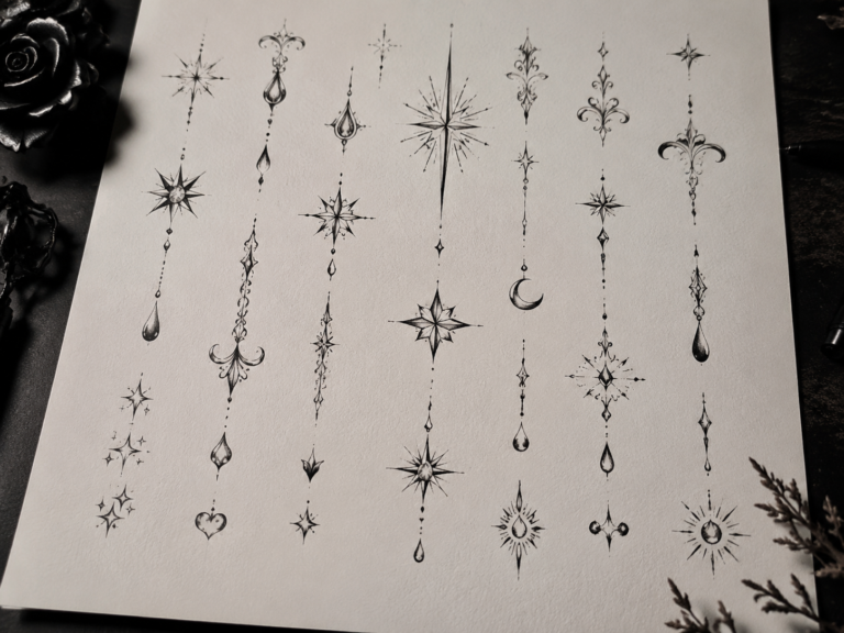
Use the style directions as a way to compare references: Fine script, Bold serif, Handwriting, Gothic letters, and Typewriter style. If those examples look unrelated, the style may need a tighter brief before the artist can design something coherent.
| Reference to compare | What to inspect | Decision rule |
|---|---|---|
| Fine script | Soft personal look | Can close up |
| Bold serif | Readable statement | Needs style fit |
| Handwriting | Personal source | Needs cleanup |
| Gothic letters | Strong visual style | Can get dense |
| Typewriter style | Clean nostalgia | Spacing matters |
Artist fit matters more than the trend name
Some tattooers are strong at bold traditional work and weak at tiny realism. Some can draw ornamental symmetry but not faces. Some can pack black smoothly but struggle with delicate color. Match the artist to the style, not just the studio location.
Healed portfolio examples matter here. Fresh photos show the first hour. Healed photos show whether lines hold, shading settles smoothly, and the tattoo still reads without perfect lighting.
How to brief the design without over-controlling it
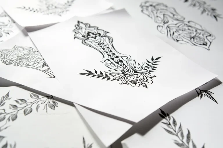
Bring references for mood, placement, and detail level. Then give the artist room to redraw the idea for skin. A tattoo design has to survive curves, pores, movement, sun, and time; a flat reference image does not.
Visual reference note: Save references that show healed work, not only viral fresh tattoos. If a style looks good only under studio lighting, ask what it looks like six months later.
Reader questions before you book
Is this style good for a first tattoo?
It can be, if the design is readable, the placement is realistic, and the artist has healed examples in the same style.
How do I know if an artist can do this style?
Look for healed work, not just fresh photos. Check line consistency, shading, symmetry, and whether similar designs still read clearly.
Should I make the design smaller to save money?
Not if size is what keeps the tattoo readable. Shrinking a detailed style often creates a weaker tattoo and a future touch-up problem.
What should I bring to the consultation?
Bring style references, placement photos, a rough size range, and notes on what you do not want. That is enough for a good artist to design from.