A realistic lighthouse tattoo is one of those pieces that either stops people in their tracks or ages into a grey blob you hide under long sleeves. I’ve tattooed dozens of these over the years, from tiny Cape Hatteras replicas on wrists to full back pieces with storm waves crashing against granite. The appeal is obvious: lighthouses carry weight. They’re solitary, they’re functional, they stand against something. But translating that tower, that beam cutting through fog, that weathered brick texture into skin that moves and ages? That’s where most designs live or die.
Origins & History
From Sailor Flash to Photorealism
Traditional lighthouse tattoos go back to the 1930s and 40s, bold outlines, limited color, usually paired with a ship or an anchor. Sailors got them for practical reasons: lighthouse meant home port, safety, the end of a long haul. The style was readable from across a bar, which was the whole point.
Realistic lighthouse work didn’t really take off until the mid-2000s, when artists started pushing photorealism in tattooing. Equipment got better, coils that could run softer, cartridges that held consistent needle groupings, machines with actual stroke adjustment. Suddenly you could build a beam of light with soft grey wash instead of just a yellow cone. You could render salt-bleached wood, rusted iron galleries, the way fog actually sits around a tower instead of looking like cotton balls.
I’ve got a client who flew in from Maine specifically to get a realistic Portland Head Light piece. His grandfather was a keeper there. That connection drives a lot of these requests, it’s not just “I like lighthouses,” it’s “this specific tower means something.”
Key Characteristics & Motifs
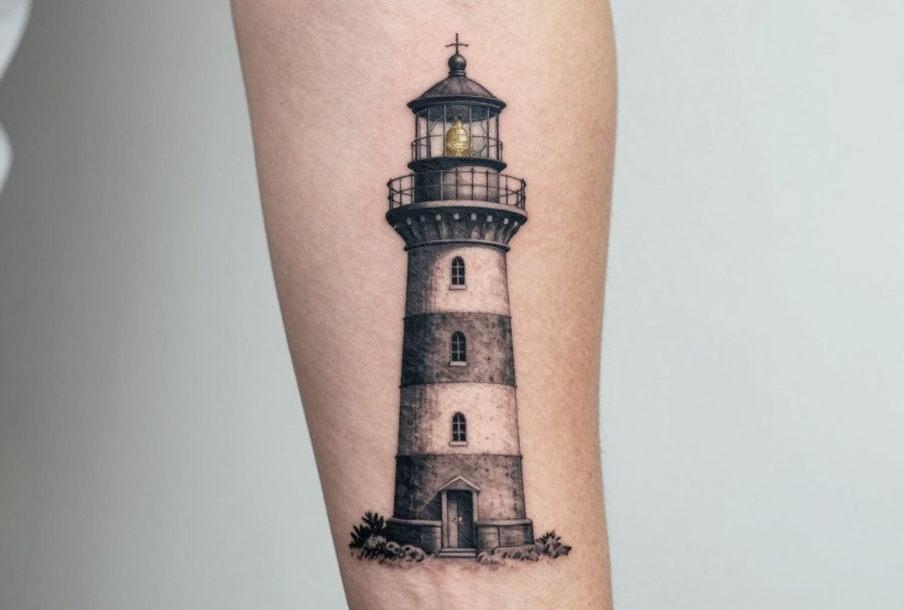
What separates a realistic lighthouse from a stylized one comes down to detail hierarchy and light behavior. Here’s what I focus on in my chair:
- Texture variation: The masonry or shingle exterior needs to read differently than the metal gallery, differently than the glass lantern room. Each surface catches light its own way.
- The beam as negative space: In black and grey, the light beam is often uninked skin with soft grey edges. In color, it’s warm yellows fading to nothing. Either way, it’s about value contrast, not a hard line.
- Atmospheric context: Realistic pieces almost always include environment, waves, fog, night sky, rocky shore. The lighthouse reads as “real” because it’s grounded in a place.
- Weathering and age: Perfectly clean lighthouses look like illustrations. The good ones have streaked rust, bird droppings, salt stains, maybe a cracked lens.
- Scale accuracy: The lantern room proportions, the gallery railing spacing, the taper of the tower, these details matter to people who know the specific lighthouse.
The Beam Problem
This is where most realistic lighthouse tattoos fail. I’ve seen beautiful towers with a beam that looks like a solid triangle of white ink. That’s not how light works on skin. The beam needs to fade, to feel like it’s passing through atmosphere. I usually build it with a 7-mag shader, working from the lantern outward in passes that get progressively softer. The brightest point is the source; everything else is suggestion. On darker skin tones, we sometimes use very light grey-blue instead of trying to hold bright white, which can ash out or disappear entirely.
Color vs Black and Grey
Color realistic lighthouse work is less common than you’d think, and there’s a reason. The classic lighthouse palette, red and white bands, blue ocean, yellow beam, can look stunning fresh. But red fades fastest. Those crisp candy-cane stripes? In five years, the red is pinkish-brown, the white is skin-tone, and the whole thing reads as muddled if the original values weren’t structured right.
I tell clients: if you want color, commit to touch-ups every few years, or design around the fade. Deep navy water holds better than bright cerulean. Burnt orange rust ages more gracefully than fire-engine red. The beam in color work should stay warm, ochre, pale amber, maybe a touch of white highlight, not cold blue-white.
Black and grey is where realistic lighthouse tattoos really sing. You get the full range of atmospheric effects: fog as soft grey wash, night sky as saturated black with subtle star dots, water as reflected light values. The beam reads as actual light because it’s the lightest value against darker surroundings. It’s the approach I push for unless someone has a specific color reference they can’t shake.
Best Placements
Tower proportions dictate placement more than most subjects. A tall, narrow lighthouse needs vertical real estate. A squat, wide tower can work horizontally. Here’s how it breaks down in practice:
- Outer forearm: Classic vertical placement. The tower runs with the bone, the beam can extend toward the wrist or elbow. Good visibility, moderate pain. I’ve done probably fifteen here.
- Calf/lower leg: Another vertical option with more width. The lighthouse can sit above the ankle, waves wrapping toward the shin. Heals well, less sun exposure than arms.
- Upper arm/shoulder cap: Works for a lighthouse with wide environmental context, storm sky above, waves below. The curve of the shoulder can actually help with atmospheric perspective.
- Ribcage: Painful. The tower gets distorted by breathing and movement. I only recommend this for experienced collectors with significant body work already.
- Back piece: Where you can really build a scene. Full horizon line, multiple towers in distance, detailed wave action. I’ve done two of these, both took multiple sessions.
- Thigh: Underrated. Flat, stable, plenty of room. The lighthouse can be substantial without being huge.
Small realistic lighthouse tattoos, under three inches, are tough. The detail that makes them “realistic” just doesn’t hold. I steer people toward slightly stylized or single-needle approaches at that scale.
Who It Suits
Not everyone. Realistic lighthouse work reads masculine by default in tattoo culture, though that’s shifting. I’ve tattooed them on sailors, on therapists, on a woman who grew up in a lighthouse keeper’s cottage, on a guy who just thought they looked cool and got tired of explaining that yes, he knew it was a cliché.
The people who sit best with these pieces tend to have some connection to coastlines, to isolation, to guidance metaphors that aren’t sentimental. If you’re getting a lighthouse because you saw it on Pinterest and it “spoke to you,” I don’t judge, but I do ask more questions. The best lighthouse tattoos come from specific reference, your grandfather’s photos, that trip to Nova Scotia, the tower you can see from your kitchen window.
Skin type matters too. Very oily skin softens detail faster. Very dry skin can hold crisp lines but might need more moisturizing during healing to prevent scabbing in dense black areas. I adjust my approach, more stipple, less solid saturation, based on what I’m working with.
Modern Variations
The field’s gotten more interesting in the last five years. I’m seeing:
- Split-time pieces: Half the lighthouse in daylight, half in storm, the beam connecting both states. Technically challenging, visually striking.
- Abandoned lighthouses: Overgrown, collapsed gallery, the beam dark. Post-apocalyptic without being literal about it. Appeals to a different emotional register.
- Multiple exposure effects: The lighthouse overlaid with wave patterns, with constellation charts, with handwritten coordinates. Requires a client who trusts the artist’s composition sense.
- Micro-realism: Single-needle work, palm-sized, insane detail that won’t last ten years but looks incredible in photos. I warn about this every time. Some people don’t care.
- Neo-traditional hybrids: Bold outline on the tower structure, realistic rendering inside. Best of both worlds for longevity and visual punch.
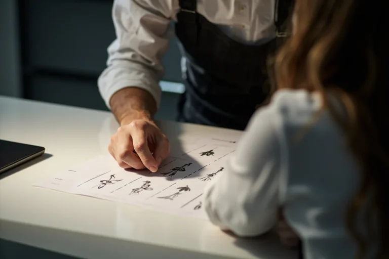
Choosing an Artist
This is the part that matters most. A realistic lighthouse tattoo lives or dies on the artist’s understanding of architecture, atmosphere, and how both translate to skin. Look for:
- Structural drawing ability: Can they draw a cylinder in perspective? A lighthouse is basically a tapered cylinder with attachments. If their sketching looks wobbly, the tattoo will too.
- Atmospheric work in their portfolio: Not just lighthouses, any piece with fog, distance, light effects. That’s the skill set you need.
- Healed photos: Anyone can make a tattoo look good fresh. Ask to see work that’s two years old. How’s the beam? The fine detail in the lantern room?
- Willingness to say no: An artist who’ll tell you your reference photo is too dark, your placement won’t work, or your skin tone needs a different approach is an artist who cares about the piece lasting.
I’ve turned down lighthouse work when someone wanted a full-color piece on the top of their foot, or a micro-realistic tower the size of a quarter. Not because I couldn’t do it, but because I’d be taking money for something I knew would disappoint them. Find an artist with that same standard.
Final Thoughts
Realistic lighthouse tattoos are demanding subjects that reward patience, yours and your artist’s. They need space to breathe, technical skill to build atmosphere, and a reference point that matters enough to sit through the hours. The best ones I’ve done, the ones I still think about, came from clients who brought me stories, not just pictures. A lighthouse is already a symbol. Your job is to make it yours, and your artist’s job is to make it real on skin that will carry it for decades.
Take your time choosing. Sit with the design. And when you find the right artist, trust them enough to let the beam fade where it should fade, let the stone weather where it should weather. That’s where the realism lives.
Frequently Asked Questions
How long does a realistic lighthouse tattoo typically take?
A palm-sized black and grey piece runs 3-4 hours. Larger work with full environment, storm waves, detailed sky, multiple light sources, can stretch to 8-12 hours across multiple sessions. I always book conservatively; rushing atmospheric detail is how beams turn into cones.
Will the beam of light still look good as the tattoo ages?
The beam is usually the first thing to soften, since it’s built on subtle value shifts rather than solid ink. In black and grey, it can fade to a gentle glow that still reads. In color, especially white-heavy work, it may need refreshing after 5-7 years. Design for the fade from the start.
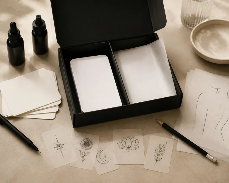
Can you tattoo a specific real lighthouse I have photos of?
Absolutely, and I prefer it. Bring multiple angles, different lighting conditions, and any historical photos if it’s changed over time. I’ll usually composite the best elements, maybe the current tower with the original fresnel lens, or a weather state that matches your story.
Is the ribcage really that bad for this design?
It’s the most painful common placement, and the breathing motion distorts the tower during the session, making clean lines harder. I’ve done two rib lighthouses in fifteen years, both on experienced collectors who specifically wanted the concealment. Most people are happier with forearm or calf.