Feminine tattoo ideas do not have to mean tiny, pink, fragile, or easy to ignore. A feminine tattoo can be dark, bold, architectural, floral, symbolic, or minimal if the design fits the person wearing it.
Quick answer: Strong feminine tattoo ideas include fine line florals, ornamental spine pieces, blackwork flowers, butterflies, birth flowers, shoulder caps, traditional roses, small symbols, rib designs, and bold tattoos with clean composition.
Feminine tattoo directions by mood
Start with the mood rather than a fixed symbol. That keeps the tattoo from becoming a recycled save.
| Direction | Best fit | What to watch |
|---|---|---|
| Soft floral | Ribs, forearm, shoulder | Do not crowd petals |
| Dark feminine | Back, hip, thigh, shoulder | Needs contrast and confidence |
| Ornamental | Spine, sternum, shoulder | Symmetry must be clean |
| Traditional rose | Bold feminine work | Line weight is the appeal |
| Tiny symbol | Private first tattoo | Needs enough size to heal |
Start with a mood, not a Pinterest board. Soft and romantic lands in delicate botanical line work, single-needle roses, or watercolor-bleed florals on the inner arm or collarbone. Bold and unsentimental hits different: geometric mandala fills, blackwork moth panels on the thigh, or a saturated neo-trad peony that reads from across the room. Dark and weird is its own category too. Serpents, corvids, and lunar cycles drawn in fine black and grey on the ribcage or upper back will heal sharp and stay sharp for years if the artist knows how to whip shade properly.
Moody and nature-forward is probably the biggest request in the shop right now, and for good reason. Mushrooms, moths, botanical anatomy, tide charts, and constellation maps all carry specific personal meaning without screaming any one label. Pick the mood first and let the style follow. That order makes the reference-gathering process faster, keeps your consultation tight, and almost guarantees you end up with something that still feels right in ten years.
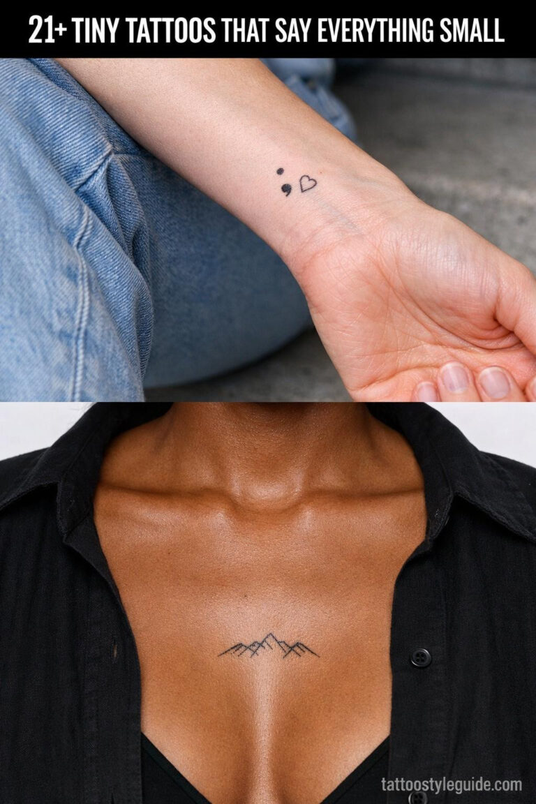
Do not let size define the style
Feminine doesn't mean fragile, it means intentional.
Many people ask for feminine and then automatically shrink the design. That is not always the best move. A large shoulder flower can feel more elegant than a tiny wrist flower that disappears after a year.
The more delicate the style, the more important the artist becomes. Fine line and ornamental tattoos should be judged by healed examples, not only fresh photos.
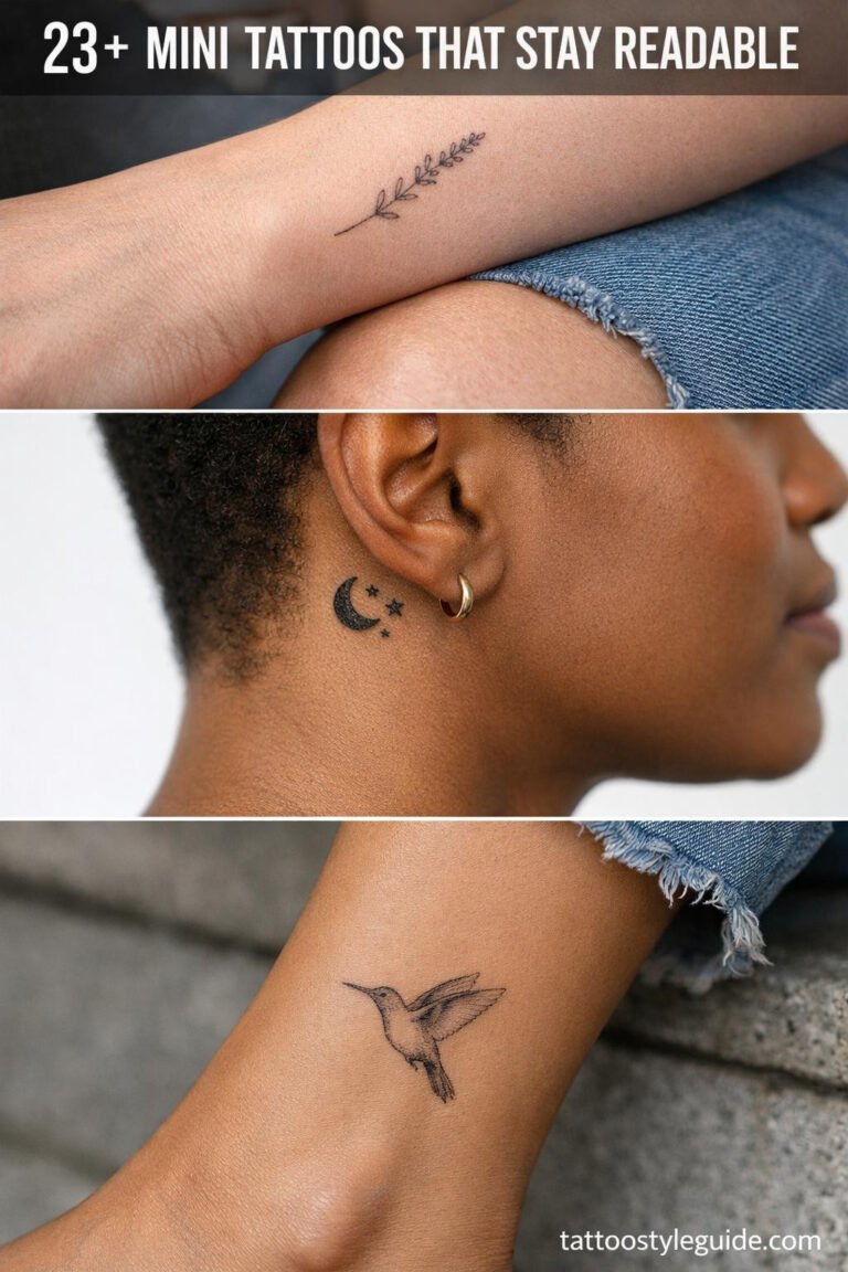
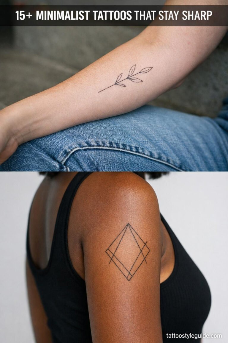
A tiny fine-line piece can be stunning, but size is not a substitute for design quality. Small tattoos on high-wear zones like fingers, the outer wrist, or the side of the hand fade fast, blow out at the edges, and lose detail within two or three years. If you want something delicate and small, put it somewhere that heals nice and stays protected: inner upper arm, sternum, back of the neck under the hairline. Those spots hold crispy lines and clean gradients longer because they see less sun and friction.
Going bigger does not mean going bolder in color. A palm-sized black and grey piece with careful shading and strong composition will outlast a small, overworked fine-line cluster every time. If your artist says a design is too detailed for the size you want, listen. That is not an upsell. That is them protecting your healed result. Bold will hold is a cliche because it is true.
Artist and placement checks
Bring references, but let the artist adapt them to the body.
- Ask if the design needs more size for the chosen placement.
- Ask whether the tattoo should follow a body line.
- Ask for healed examples of delicate work.
- Ask if the composition still works without extra symbols.
Check an artist’s healed work, not just the fresh photos. Fresh tattoos always look great. Healed work tells you whether their lines stay crisp, whether their color stays saturated, and whether their black and grey actually settles clean without going muddy or greenish. Ask them directly for healed shots in the same style you want. Any solid artist has them. If their portfolio is all fresh-only, that is a flag worth paying attention to before you book.
Placement is a design decision, not an afterthought. The ribcage is spicy, heals slower, and demands a design built for that narrow curved canvas. The outer thigh gives you a large flat panel and is one of the lower-pain real estate options on the body. The inner bicep sits in a medium zone, hides easily, and heals well. Match the design shape to the body part. A long vertical piece belongs on a long vertical surface. A round mandala belongs somewhere flat and wide. Getting this wrong wastes money and a good design.
The cliche problem
The cliche is rarely the symbol itself. Butterflies, roses, moons, and flowers can all work. The issue is copying the same arrangement, same placement, and same tiny scale everyone else used.
Make one decision custom: the flower species, the body line, the scale, the style, or the supporting detail. One smart change is enough.
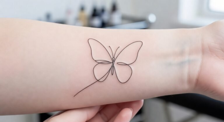
The butterfly-on-wrist and infinity symbol had their run. The problem is not that they are girly, it is that they carry no specific meaning for the person wearing them anymore. A design becomes a cliche when it exists to signal femininity rather than to communicate something personal. Butterflies can still work if the execution is strong and the context is yours. A hyper-realistic black and grey death’s-head moth on the inner forearm is not the same conversation as a outline butterfly from a flash sheet.
The real fix is specificity. Instead of a rose because roses are pretty, pick the exact variety that grew in your grandmother’s yard and bring a photo. Instead of a generic moon phase strip, map the actual lunar cycle from a date that matters. That level of detail costs you ten minutes of research and gives your artist something real to build from. It also makes the tattoo harder for someone else to copy, which matters more than most people admit.