American traditional tattoos are not timeless by accident. The style uses bold outlines, readable shapes, limited color, and motifs that were designed to be recognized quickly on skin.
Quick answer: American traditional tattoos usually feature bold black outlines, simple shading, limited color, and classic motifs like roses, daggers, eagles, anchors, swallows, hearts, panthers, ships, snakes, and skulls.
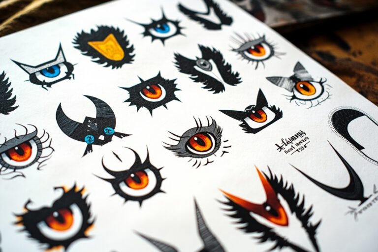
Classic American traditional motifs
The motif matters, but the style rules are what make the tattoo age well.
| Direction | Best fit | What to watch |
|---|---|---|
| Rose | Love, beauty, grief, classic filler | Needs bold petals |
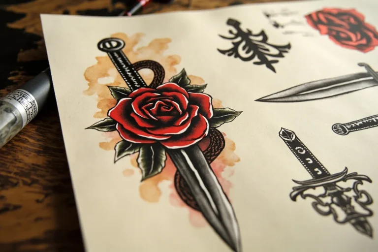
| Dagger | Conflict, courage, survival | Works well with rose or snake |
| Eagle | Freedom, force, patriotism | Needs enough size |
| Swallow | Travel, return, loyalty | Keep shape simple |
| Panther | Power and aggression | Black saturation matters |
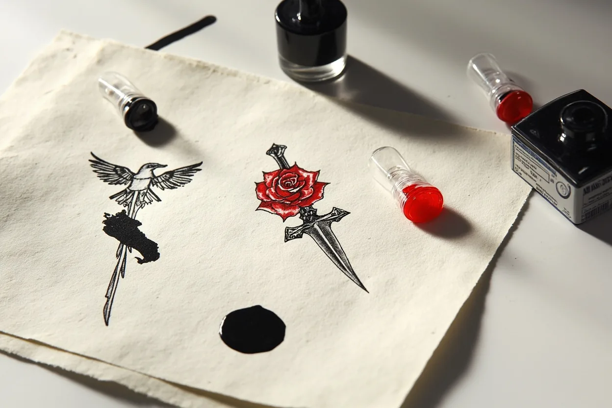
The core lineup is eagles, panthers, daggers, anchors, swallows, roses, pin-up figures, and ships. Every motif carries a specific weight in the tradition. Swallows meant a sailor logged 5,000 miles. Panthers read as raw aggression. Roses balanced that out with something softer. Each image was designed to be readable at arm’s length, which is why the outlines are thick and the fills are flat, saturated blocks of red, yellow, green, and black.
Placement was never random in classic American traditional work. Anchors lived on forearms. Eagles spread across chests and backs where they had room to breathe. Daggers worked on calves and outer arms. The motifs were built for specific body planes, and they still look best in those spots. A panther crammed onto a wrist loses everything that makes it powerful.
Why the style lasts
If the outline isn't bold enough to read from across the room, it isn't Traditional.
Traditional tattoos were built for skin before they were built for feeds. Thick outlines hold the design together after years of sun, movement, and normal ink spread.
The limited palette is also practical. Red, green, yellow, and black can make a strong tattoo without relying on delicate gradients.
American traditional holds up because the fundamentals are structurally sound. Heavy black outlines, 3mm to 5mm wide, form a wall that keeps color from migrating outward. That’s what blowout is, color or ink bleeding past the outline into surrounding skin. With traditional, the outline is thick enough to absorb years of ink spread and still read clean. The saturated color fields fade gradually and evenly rather than patchwork.
Skin is not a flat stable surface. It creases, stretches, and thins over decades. Traditional designs account for that because they were never built on fine detail. A panther’s face with bold graphic features still reads at 60. A hyper-realistic portrait or fine-line piece starts losing information within 5 to 10 years, especially on high-wear zones like hands, fingers, and inner elbows. Bold will hold. That’s not a slogan, it’s physics.
How to choose an artist
Traditional tattooing looks simple until you compare good work to weak work.
- Look for confident black outlines.
- Check healed color saturation.
- Ask if the artist draws flash or only copies references.
- Check whether the design reads from across the room.
Look at healed work, not fresh photos. Fresh tattoos are always going to look crisp because the ink is sitting right at the surface. You want to see pictures taken at least 6 to 8 weeks post-heal, ideally older. Ask the artist directly for healed examples of their traditional work. If they only show fresh pieces, that tells you something. Check that their outlines are consistent, no wobbly sections, no lines that thicken and thin unevenly through a curve.
Portfolio style match matters more than general talent. An artist who kills it in neo-traditional or black and grey may not have the specific muscle memory for the flat color fills and tight outlines that American traditional demands. Whip shading and color packing are different technical skills. Book a consultation, bring reference images, and ask how they approach color saturation on your specific skin tone. Darker skin tones need higher pigment saturation to get colors to pop, and not every artist adjusts for that.
Traditional tattoo mistakes
Do not thin out every line because you want the tattoo to feel more delicate. Once the style loses structure, it loses the reason it lasts.
Avoid stuffing too many motifs into one small piece. A rose and dagger can work. A rose, dagger, snake, banner, moon, and three dates usually cannot.
The biggest mistake is scaling the design too small. Traditional motifs are built on bold shapes and those shapes need room. A sparrow that should be 3 inches gets requested at 1.5 inches and suddenly the artist is fighting to fit outlines, fill, and detail into a space that can’t hold it. It heals muddy. The lines merge. In 5 years it looks like a smear. Respect the minimum size the style needs, usually no smaller than a silver dollar for any motif with interior detail.
The second mistake is going too dense on a body panel before you have a plan. Traditional sleeves and chest pieces look cohesive when they’re mapped out with breathing room between each piece. People stack flash back to back with no background or flow and end up with a cluttered wall instead of a readable suit. Talk to your artist about a layout before you book individual sessions. Placement on the outer arm, the upper chest, and the calf gives you the most forgiving skin with lower pain levels and better ink retention long-term.