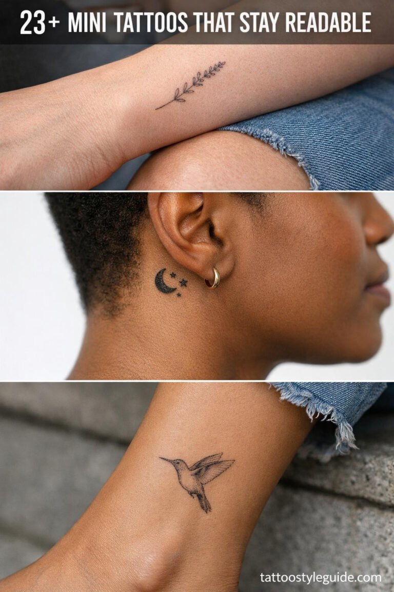
Moon tattoo meaning is usually tied to cycles, change, femininity, intuition, and time. The symbol is simple, but the phase you choose changes the tone.
Quick answer: A moon tattoo can symbolize change, phases of life, feminine energy, intuition, time, grief, growth, mystery, or calm. Crescent moons feel different from full moons, and moon phases work best when spaced clearly.
Moon tattoo meanings by phase
Choose the phase for the meaning and for the shape it creates on skin.
| Idea | Best use | Watch-out |
|---|---|---|
| Crescent moon | Growth, softness, beginnings | Can become too generic |
| Full moon | Completion or power | Needs contrast |
| Moon phases | Cycles and time | Needs length and spacing |
| Moon and flower | Feminine growth | Avoid overcrowding |
| Moon and snake | Change and rebirth | Needs style cohesion |
Each phase carries a different weight on skin. A new moon, just a sliver of black ink or negative space, reads as beginnings, the blank slate before anything starts. Waxing crescent gets tattooed by people coming out of hard seasons, building momentum. Full moon is the loudest, most legible phase from a distance, connected to completion, heightened emotion, and that classic witch-energy aesthetic. Waning phases belong to letting go, grief, transition. A lot of clients don’t realize they’re choosing a phase based on where they are in life until we talk it through.
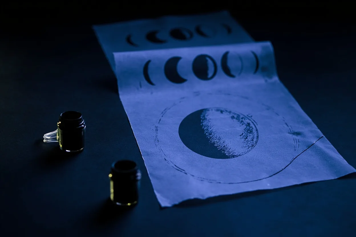
A full lunar cycle tattooed in a horizontal row is one of the most requested designs in any black and grey street shop right now. Done right, it reads clean across a collarbone or forearm. Each individual moon in the sequence needs to be sized consistently or the whole piece looks amateur. Crescent orientations matter too. A waxing crescent opens to the right in the Northern Hemisphere. Get that flipped and a dedicated client will notice. Ask your artist to reference actual lunar photos, not clipart.
The moon is simple but not empty
The phase you pick tells people where you are in your own cycle.
The moon works as a tattoo because it is recognizable even when small. That does not mean every moon tattoo should be tiny.
Moon phases need room. If the phases are too close, the design turns into a row of small dark marks instead of a readable cycle.
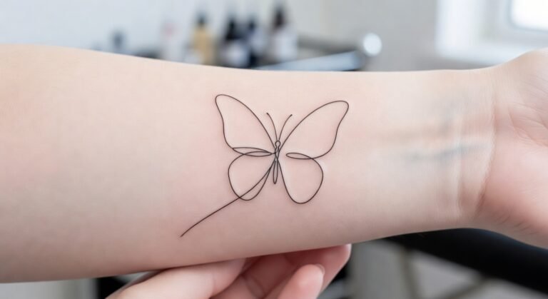
Moon tattoos are deceptively technical. A crescent looks simple until you realize the negative space IS the design. If your artist’s linework wavers even slightly, the whole shape reads off. Fine line crescents done with a 3RL or single needle look incredible fresh but thin lines in high-wear spots, like fingers, inner wrists, the back of hands, can fade or blow out within a year. Placement matters as much as the design itself. A solid 5RL or 7RL outline on a crescent holds decades better than a scratchy single-needle version in the same spot.
The fill inside a full moon is where artists separate themselves. Stippling, whip shading, smooth black and grey gradient, even a crispy solid black, all give a totally different feel. Stippling ages gracefully but needs space to breathe or it muds together over time. Solid black stays bold and reads from across the room forever. If you want texture or craters, that detail needs scale to survive, at least two inches diameter or the fine work disappears after the first heal. Talk to your artist about how the design will look in ten years, not just on day one.
Design questions
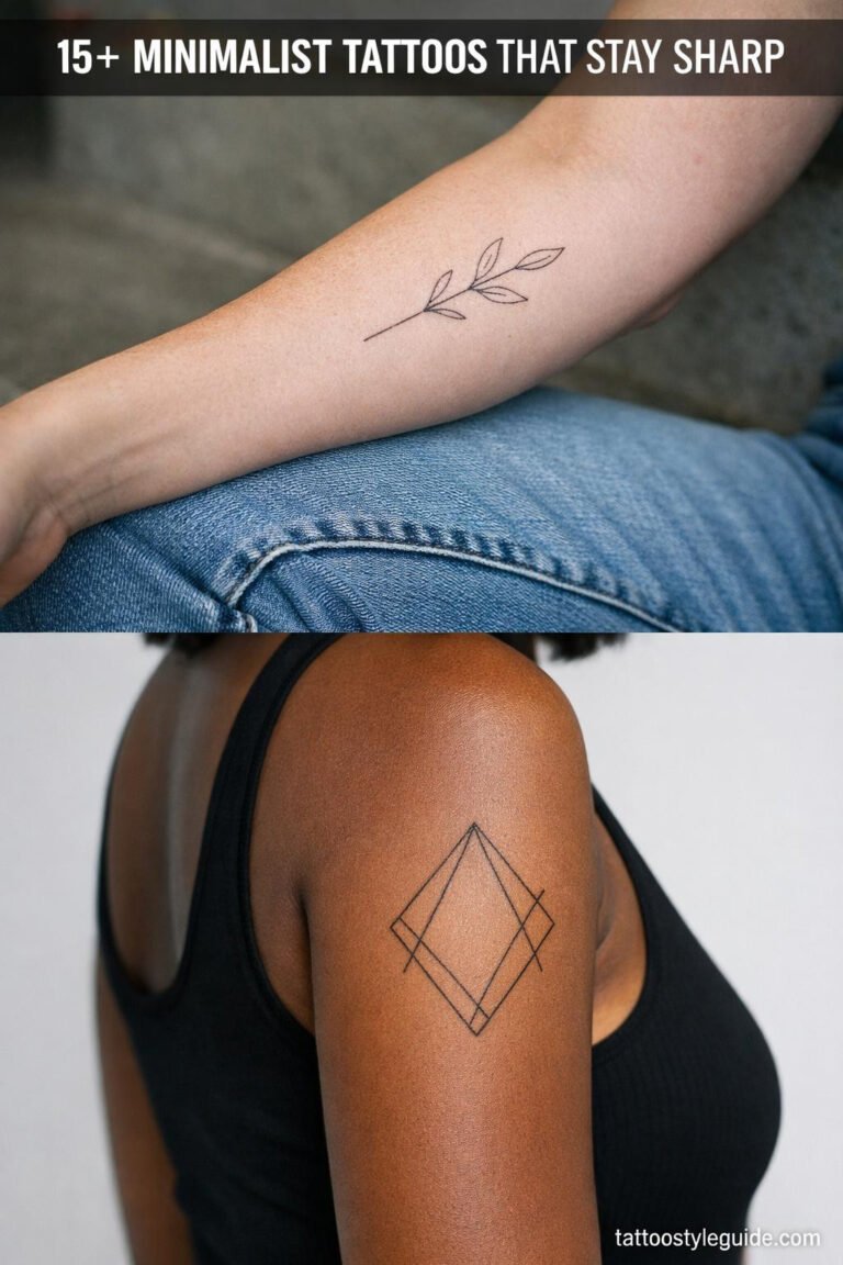
Moon tattoos can be minimalist, ornamental, blackwork, fine line, or traditional.
- Ask whether the phase spacing is large enough.
- Ask if the moon should be solid, shaded, or outline only.
- Ask how the design will read from a distance.
- Ask whether added symbols weaken the main meaning.
Size is the first real decision. A thumbnail-sized crescent on a ribcage will look wispy and disconnected. A full moon on an upper arm or thigh can hold real detail, a face, cloud cover, botanical elements wrapped around it. Placement affects shape too. Crescents follow curves naturally, collarbone, shoulder cap, behind the ear, ankle. They fight against flat rectangular zones like shins or forearms unless you orient them to follow the muscle line. Think about how the tattoo moves with your body, not just how it looks standing still in a mirror.
Color versus black and grey is a legitimate fork in the road. A black and grey moon is timeless and ages predictably. Color moons, pale lavender, soft gold, deep navy with a white highlight, look stunning fresh but require touch-ups more frequently, especially pastels and white ink, which can yellow or disappear in two to three years depending on skin tone and sun exposure. If you want that dreamy watercolor moon, go to an artist who specializes in it and budget for a touch-up session around the two-year mark. White highlights over healed black and grey are a solid middle ground.
Moon tattoo mistakes
The easiest mistake is building the same crescent moon everyone has already saved. Change placement, scale, style, or supporting symbol if you want it to feel personal.
Avoid tiny moon phases on fingers or behind the ear if readability matters.
The most common mistake is going too small. Clients see a delicate fine-line moon on Instagram, usually shot at close range with a macro lens, and ask for that at half the size. At that scale, any interior detail, a face, stars, botanical fill, turns into a muddy blob by year two. Scale up even slightly and the design breathes, lines stay crispy, and the healed result actually matches what you saw online. A tattooist who talks you into going bigger is usually doing you a favor.
Placement regret is real with moon tattoos. The behind-the-ear spot is very spicy, heals inconsistently on a lot of skin types, and is a high-wear zone from glasses and hair friction. Finger and hand moons look great for about six months, then they fade hard. If you want longevity, upper arm, calf, shoulder blade, and outer thigh are your friends. Ribs look incredible but hurt, sitting is a six or seven on the pain scale for most people, and the skin there is thinner so shading needs a light hand or it blows out fast.