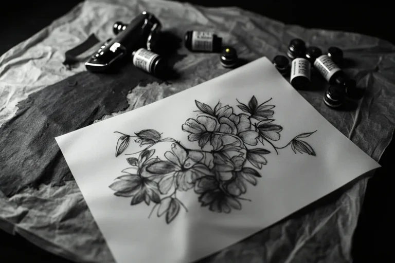
Small wrist tattoo ideas look discreet, but the wrist is not neutral skin. It bends, rubs against sleeves and watches, sees sun, and puts tiny linework under daily stress.
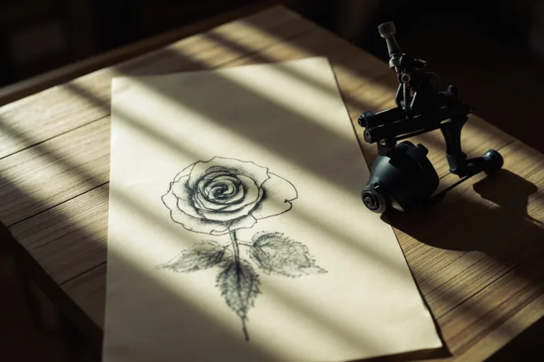
Quick answer: Good small wrist tattoo ideas include one-word script, initials, dates, tiny stars, small flowers, butterflies, moons, minimalist symbols, and simple bands placed where movement and friction are manageable.
Wrist tattoo ideas by placement
A wrist tattoo can sit on the inner wrist, outer wrist, side wrist, or wrap slightly around the arm. Each choice changes risk.
| Idea | Best use | Watch-out |
|---|---|---|
| Inner wrist word | Private reminder | High visibility and movement |
| Outer wrist symbol | Cleaner daily wear | Sun exposure |
| Side wrist flower | Soft vertical design | Needs enough height |
| Tiny moon | Simple symbol | Do not over-detail |
| Small bracelet mark | Decorative band | Straight lines must be precise |
The inner wrist is the most popular spot, but it’s also the most inconsistent healer because the skin sits over a pulse point and gets constant flexion. The outer wrist, right on that bony ridge, holds ink better long-term and stays readable from across the room without fading into a grey smear. The side wrist, between inner and outer, is a sweet zone for thin vertical designs like single stems, daggers, or stacked letters.
Below the wrist bone toward the hand, you’re hitting high-wear skin that exfoliates fast. Fine line work there softens within two years, guaranteed. Up near the forearm crease, you get a flatter surface with less daily bend, so small botanicals or geometric bands sit cleaner and age more predictably. Pick your placement based on how long you want the detail to last, not just where it photographs best.
The wrist is small but active
On the wrist, your tattoo earns its keep by being readable from three feet away.
Wrist tattoos need stronger spacing than a phone mockup suggests. The skin flexes every time you type, lift, turn a doorknob, or put on a watch.
If the design is important, avoid shrinking it just to make it more discreet. A slightly larger wrist tattoo usually looks cleaner after healing.
Your wrist moves constantly. Every time you type, grip a steering wheel, or wash dishes, the skin over that joint is stretching and compressing. That motion is exactly why fine line micro-realism on the inner wrist turns muddy by year three. Blowout risk is also real here because the dermis is thin and the ink has nowhere to anchor cleanly if the artist goes even slightly too deep.
High-wear zones need bolder linework, minimum 1.5mm line weight, so the design holds its shape as the skin turns over. If you’re set on fine line, keep the design simple: a single clean outline, no packed shading, no micro-details smaller than 3mm. Come back for a touch-up at six months. The wrist will need it, and a good artist will tell you that upfront instead of pretending it’ll stay crispy forever.
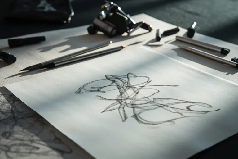
What to ask at the stencil stage
Do not approve the stencil until you have checked the wrist in motion.
- Bend the wrist before approving placement.
- Check watch and bracelet friction.
- Ask whether the line weight is too light.
- Ask if the design should move toward the forearm.
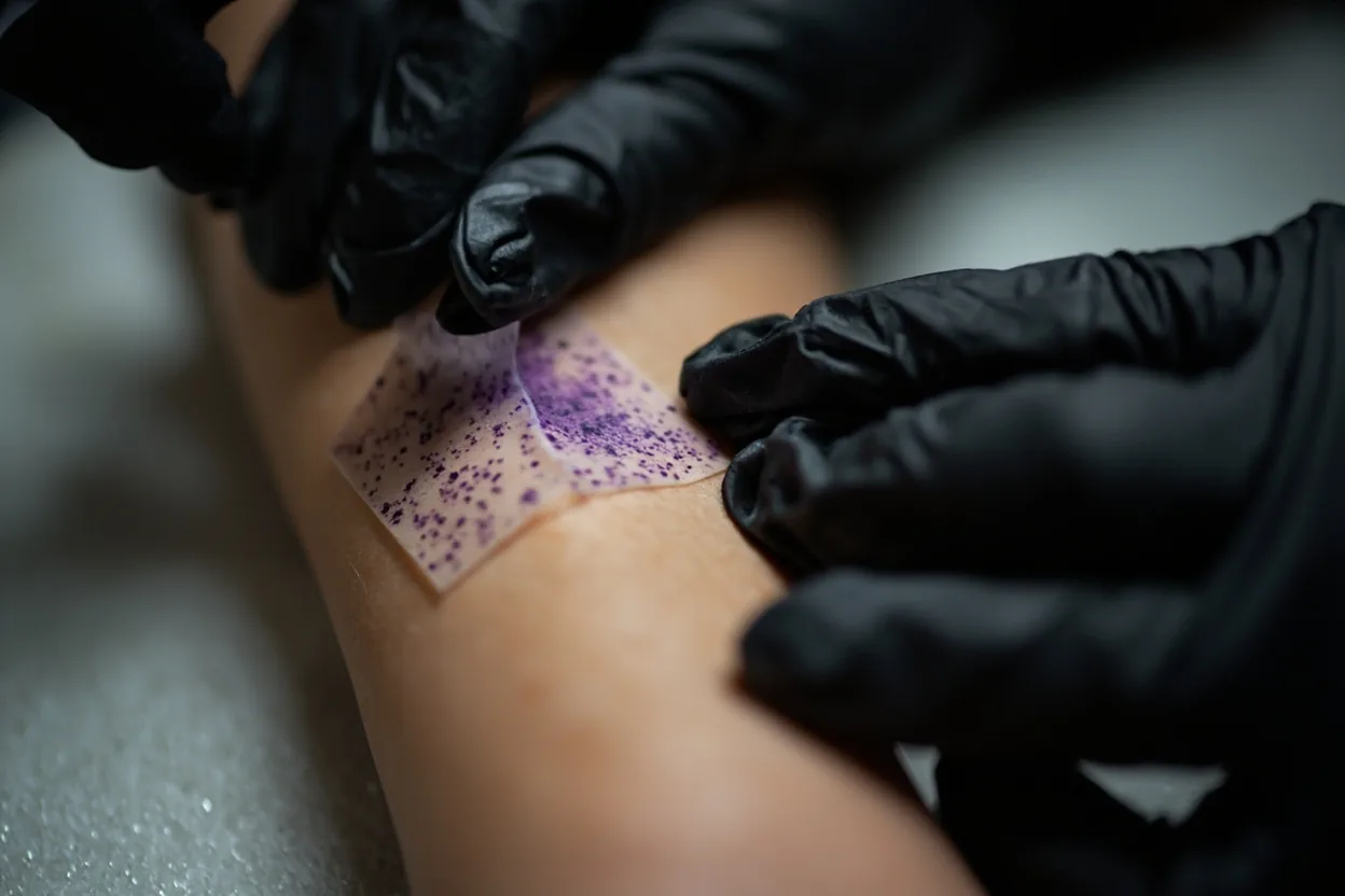
Before the stencil goes down, ask the artist to place it and let you look at it flexed and straight, not just flat. Small wrist designs shift noticeably when your wrist bends, and a word or symbol that reads perfectly at rest can warp into something unrecognizable mid-motion. Also check the stencil sizing against your actual wrist width, because what looks proportional on paper sometimes shrinks visually against bone and tendon.
Ask specifically how the artist plans to handle the thinnest lines. Will they use a single needle or a round liner? What diameter? This matters because a 1RL on that skin can blow out if the artist’s hand speed isn’t dialed in for your skin type. Oily or thick skin needs a different approach than dry, thin wrist skin. A confident artist will answer without getting defensive. If they deflect, that’s your cue to walk.
Wrist tattoo mistakes
Long quotes are the biggest wrist problem. They look meaningful in a mockup and cramped on skin.
Another mistake is placing a fragile fine line design exactly where a watch or bracelet rubs every day.
The biggest mistake is going too small with too much detail. A 2cm design with five internal elements looks incredible in a reference photo taken at macro range. On your wrist, healed, it looks like a smudge. Anything with internal detail needs to be sized so the thinnest gap between lines is at least 2mm. Anything smaller and the lines merge during healing. Your artist should resize up if your reference is too dense, not just copy it blindly.
Second most common mistake: ignoring sun exposure after the wrist heals. The inner wrist catches direct sun constantly, and UV is what pulls color out and softens black lines into grey blurs fastest. SPF 50 on the healed tattoo during the first year is non-negotiable. Skipping aftercare during the peel phase is also where people lose crisp edges, because picking or letting it dry crack will pull ink out of fresh linework and leave gaps that need a full retouch to fix.