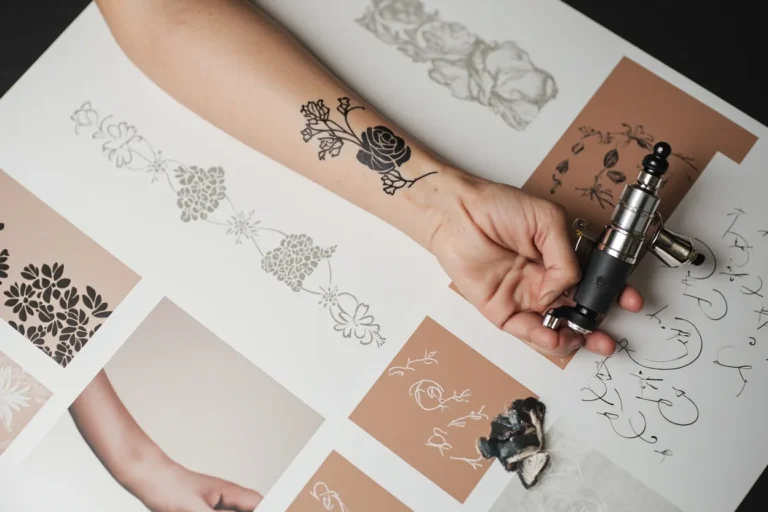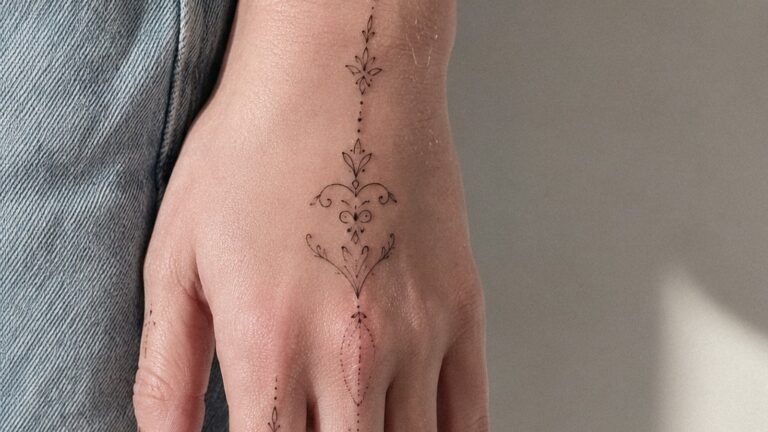
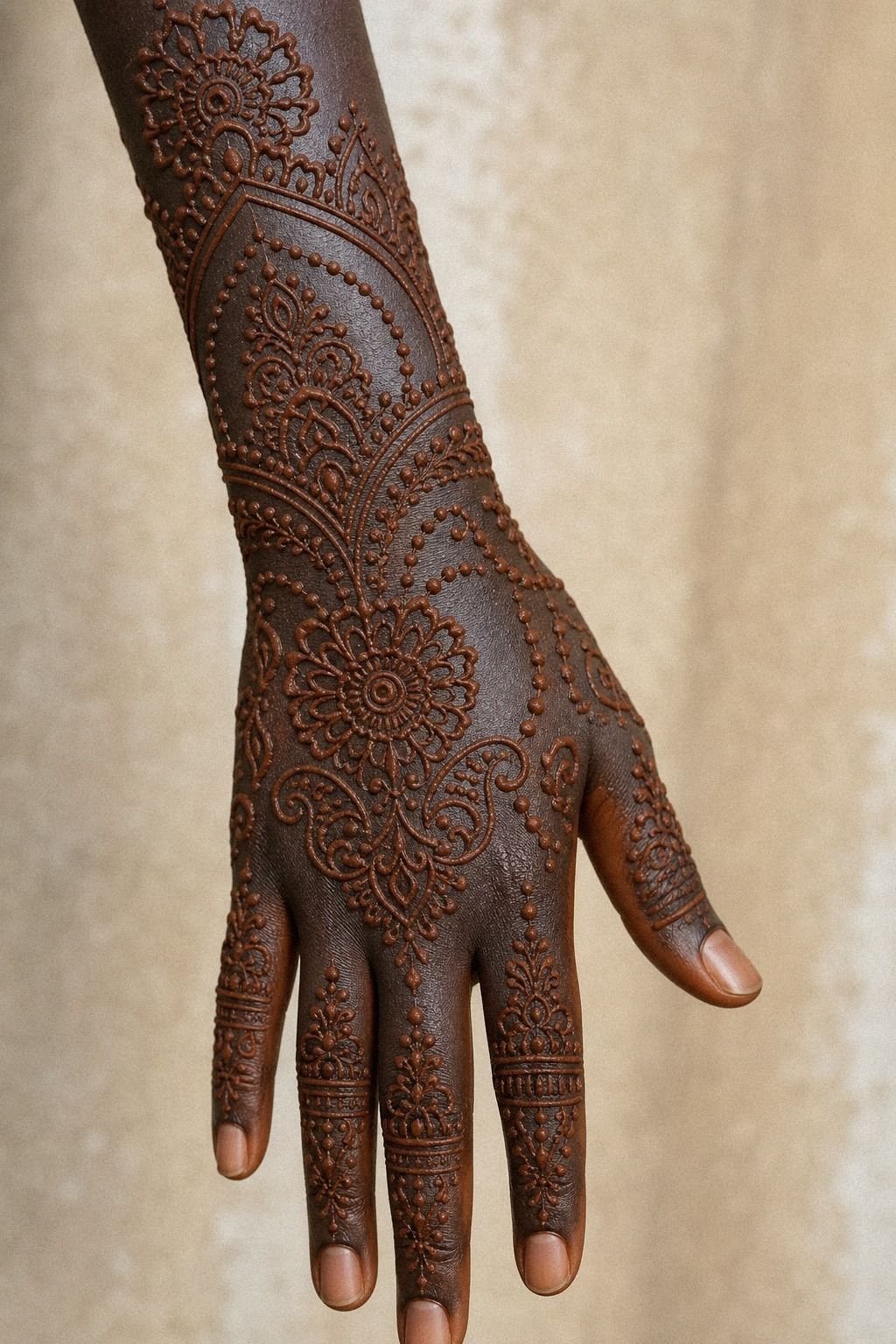
Aesthetic mehendi designs for palm hand gave me the fastest way to test a palm layout before permanent ink, about 30 to 90 minutes of drawing for a design that showed me right away what read clean and what felt crowded. I wanted the symmetry of henna, but I needed it to hold like a tattoo sketch on real skin. So I stripped it back, watched the lines settle, and found the version I’d still want if I booked it for black ink later.
Here’s what it looked like before:
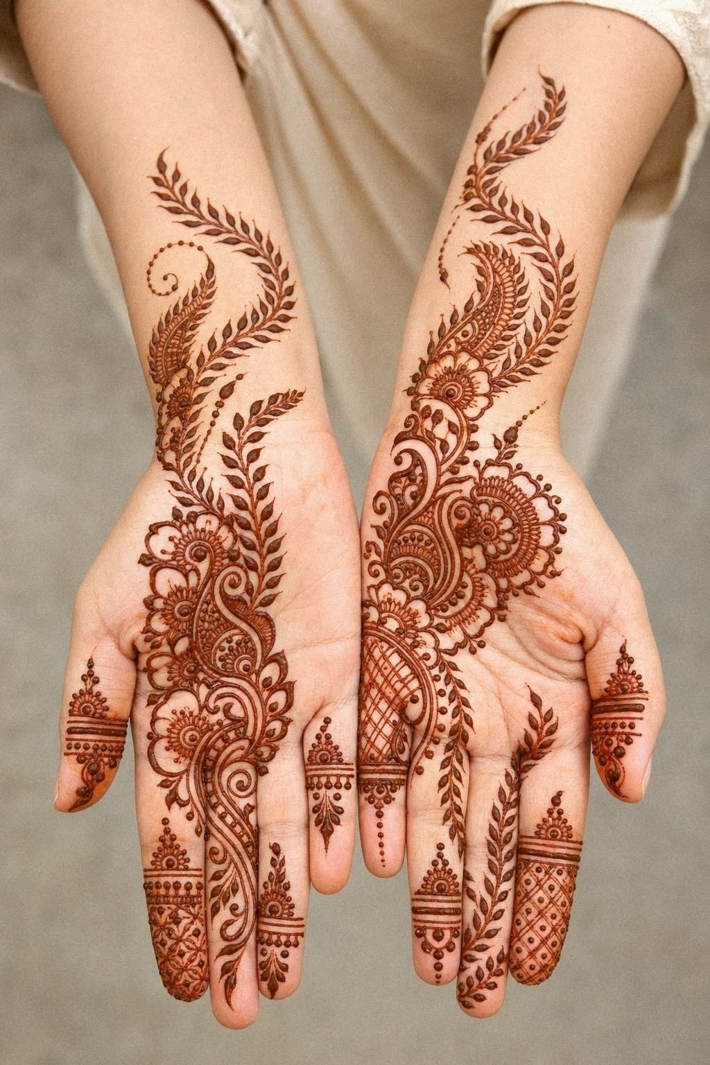
Before I touched the cone, my palm was the patch of skin I kept saving for the right idea. I had reference screenshots, a few old festival henna photos, and one problem you probably know too well: every design looked gorgeous closed up, then busy the second fingers spread apart.
Palm work does that. The skin folds, the creases break rhythm, and a soft layout can turn to visual soup fast.
I also knew I wasn’t judging this like costume art. I was judging it like tattoo planning.
If you want a hand design that ages cute on you, you need a center that still reads after movement, sweat, and a normal day of gripping your phone. That’s why I kept my test clean, reddish brown, and steady. I wanted to see which shapes breathed, which ones crowded the finger webs, and which ideas deserved to become real minimal mehendi designs later.
- I Cleaned My Palm Before Henna Paste
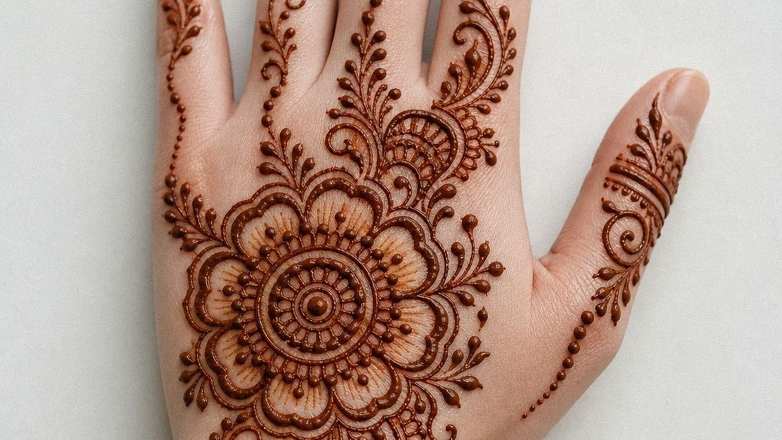
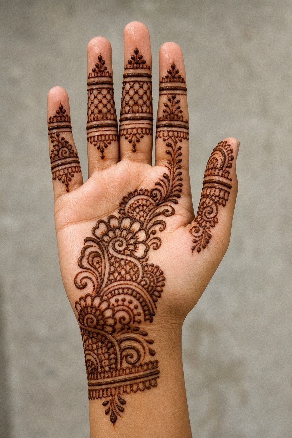
- I Chose A Simple Center Palm Mandala
- I Placed Tiny Dots Around The Circle
- I Added Fine Lines Toward Each Finger
- I Drew A Minimal Thumb Side Vine
- I Kept Negative Space Near The Wrist
- I Built A Small Floral Palm Cluster
- I Added Leaf Trails Across The Palm
- I Framed Fingertips With Light Henna Caps
- I Tested A Unique Crescent Palm Motif
- I Connected Finger Lines To The Mandala
- I Filled Gaps With Tiny Dotwork Chains
- I Kept The Front Palm Pattern Balanced
- I Added One Bold Paisley Near Thumb
- I Checked Line Thickness Before Drying
- I Cleaned Smudges Around Finger Joints
- I Let The Palm Stain Develop Slowly
- I Photographed The Design With Open Fingers
- I Picked The Cleanest Palm Mehendi Finish
1I Cleaned My Palm Before Henna Paste
First move, I cleaned my palm like I was setting up for stencil prep. You should do that too, because lotion, sweat, and sunscreen film make fresh henna skid instead of landing crisp.
I used gentle soap, warm water, and a plain paper towel so the skin stayed dry, not fuzzy with lint. That little prep step matters more than people think.
Once the skin was dry, the cone started giving me henna paste lines that felt cleaner and more controlled. But if your hand is still damp, the tip will drag and the curve won’t stay even.
I learned that the annoying way on my first try. Clean skin, relaxed fingers, one steady pull.
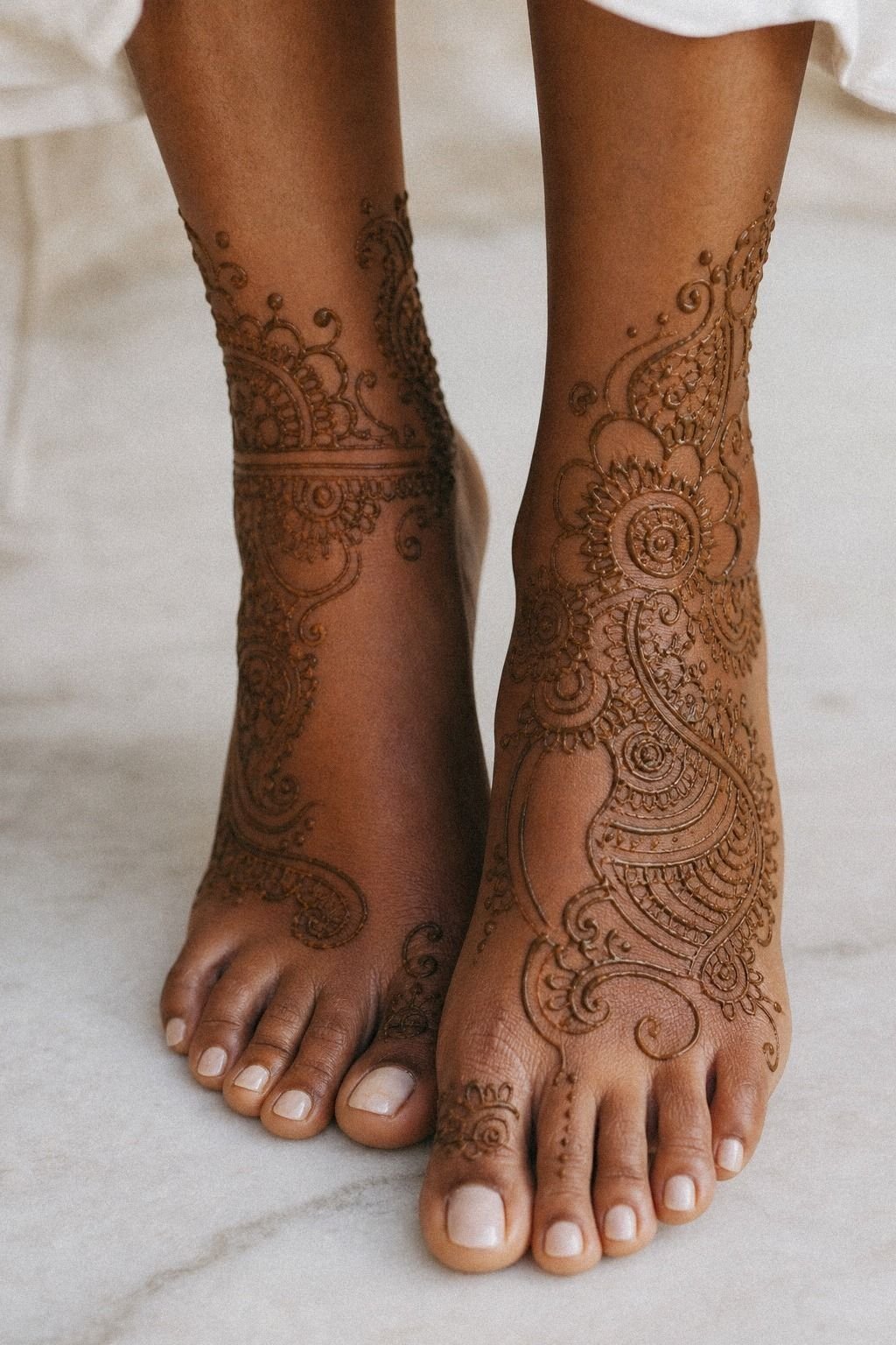
If you’re planning to compare palm flow against the back, save a few reference ideas from back hand mehndi designs so you can tell what only works from one angle.
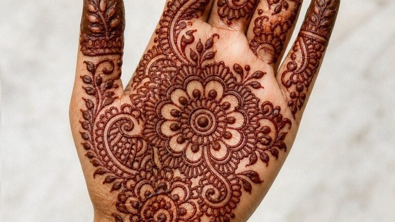
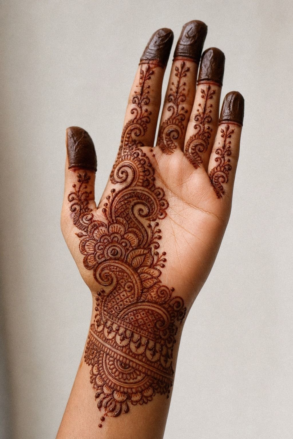
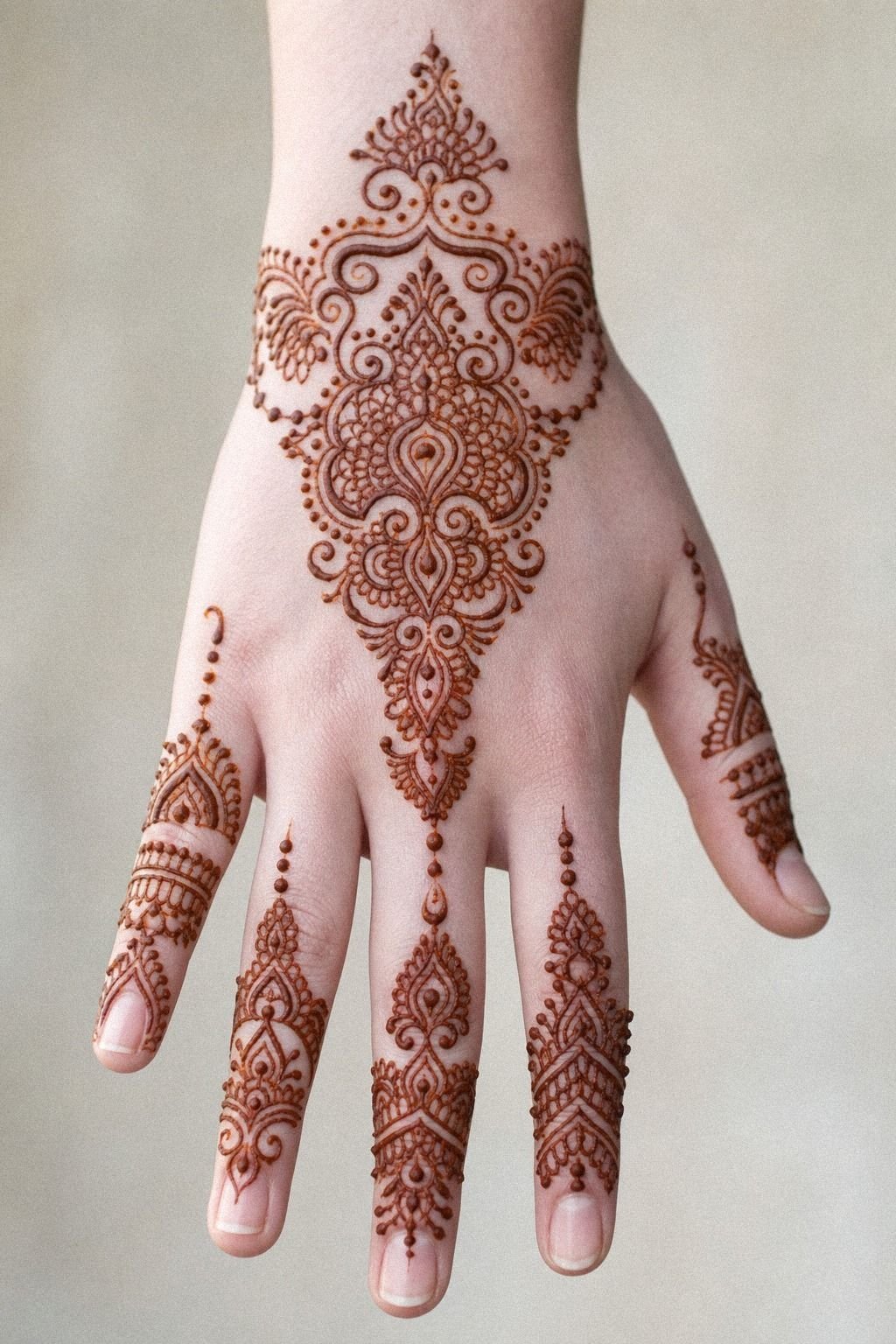
2I Chose A Simple Center Palm Mandala
The center circle made the whole design make sense.
3I Placed Tiny Dots Around The Circle
Dots sound minor until you see what they do. Around a circle, they soften the edge, guide your eye outward, and keep the design from ending too abruptly. I spaced mine with a light hand so each dot felt intentional instead of like filler.
You want rhythm here, not pepper shaken all over your skin.
The little halo of dotwork chains gave the palm a softer finish without chewing up the open skin around it. But I kept the dots slightly farther apart near the creases, because tight clusters blur visually once your hand bends.
That small change made the design feel calmer. If you’re into quiet layouts, compare it with mehendi designs for hands simple and you’ll see why less often heals nicer in permanent tattoo form too.
4I Added Fine Lines Toward Each Finger
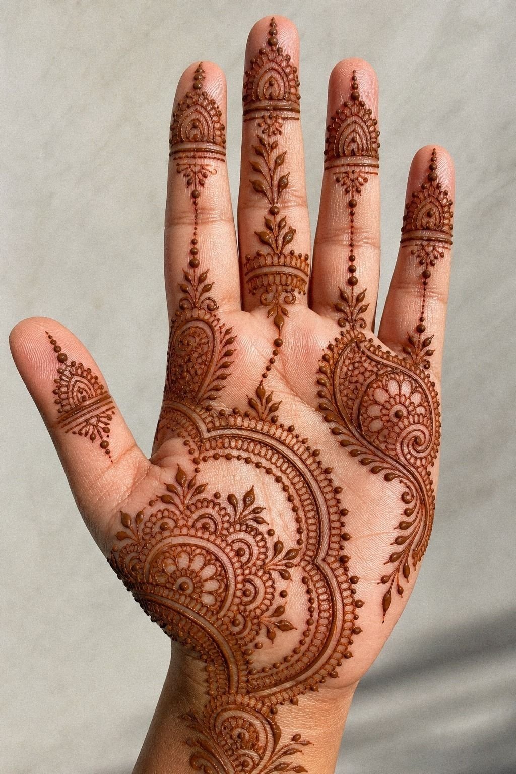
This was the part that made the design stop looking like a sticker and start looking built for the hand. I sent fine lines upward from the center so each finger felt connected, but not swallowed.
You need those lines to taper. Thick tracks from palm to fingertip can look clunky, especially once the fingers flex.
I kept the pull of each finger guide line light and confident, almost like drawing a map instead of a border. And yes, shaky repeats show.
One clean pull reads better than ten fuzzy ones. If you want the front of the hand to stay airy, don’t try to fill every gap between fingers.
The cleaner examples in front hand mehndi designs prove that connection lines work best when they leave you a little breathing clearance.
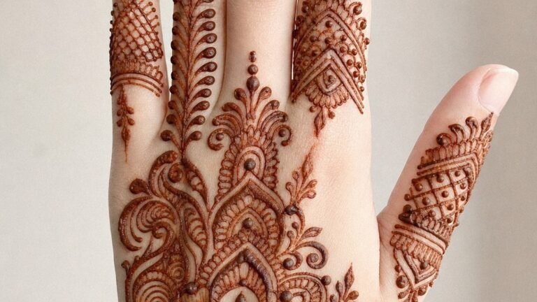
5I Drew A Minimal Thumb Side Vine
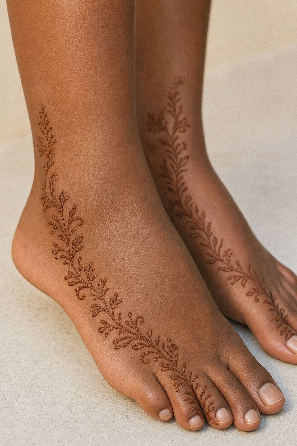
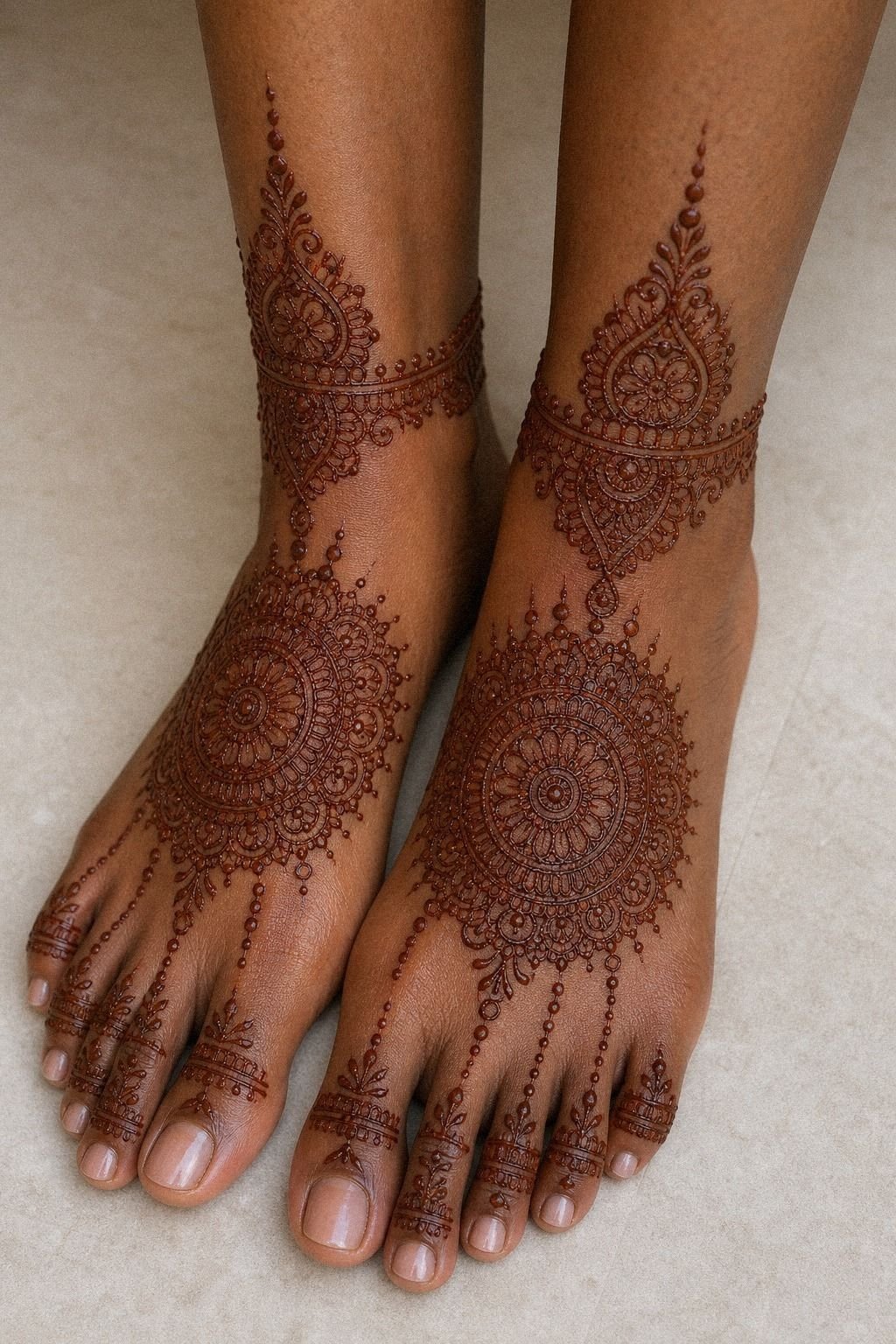
The thumb side can save a palm design or wreck it. That side curve has natural movement, so I borrowed the feel of ankle mehndi vines and drew a narrow trail hugging the outer thumb line.
Not a whole garden. Just enough bend to make the palm feel alive when the hand turns a little.
The soft curve of the thumb vine gave me shape without making the palm look overloaded from the side. But I kept the leaves tiny and spaced, because packed leaves on that edge can look scratchy in a hurry. Think graceful, not crowded.
If you want more botanical reference without losing the clean look, 24 henna designs that reward a steady hand has a few vine ideas worth stealing for vibe only.
6I Kept Negative Space Near The Wrist
Wrist crowding is where a lot of good mehendi turns muddy. I left open skin near the base of the palm so the design could stop on purpose, not just keep creeping lower.
You need that pause. On moving skin, open areas do half the visual work for you. Worth it!
That band of open skin near my wrist made the center motif feel cleaner and more expensive, even though the drawing itself stayed simple. But when I mocked up a version that dropped all the way into the forearm, it looked heavier than I wanted.
Why force more pattern if the hand already reads clean? For a similar clean-stop effect, I liked the restraint in simple mehndi designs front hand easy.
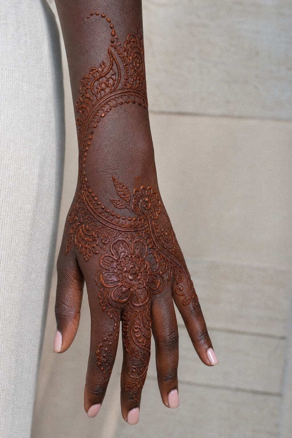
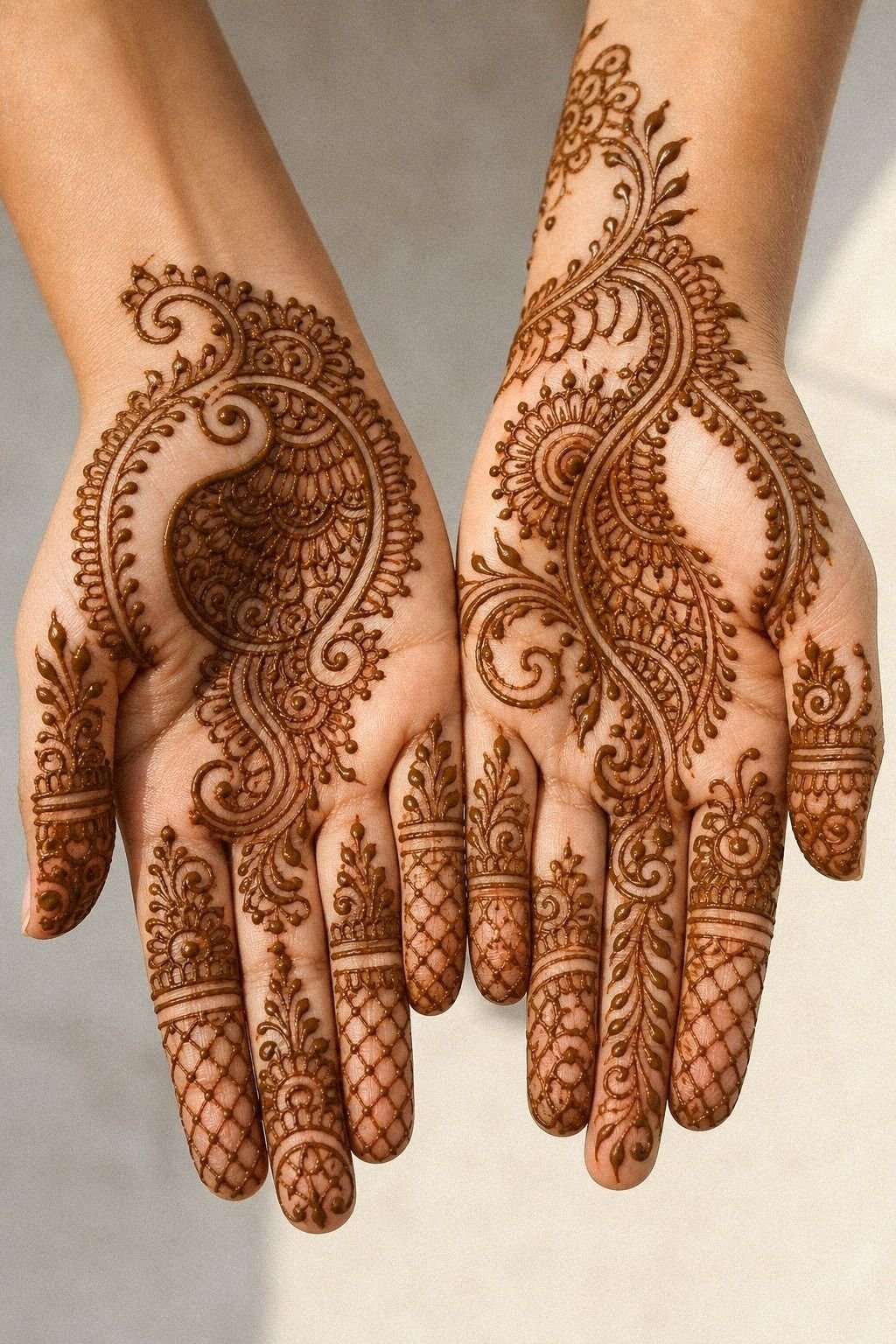
7I Built A Small Floral Palm Cluster
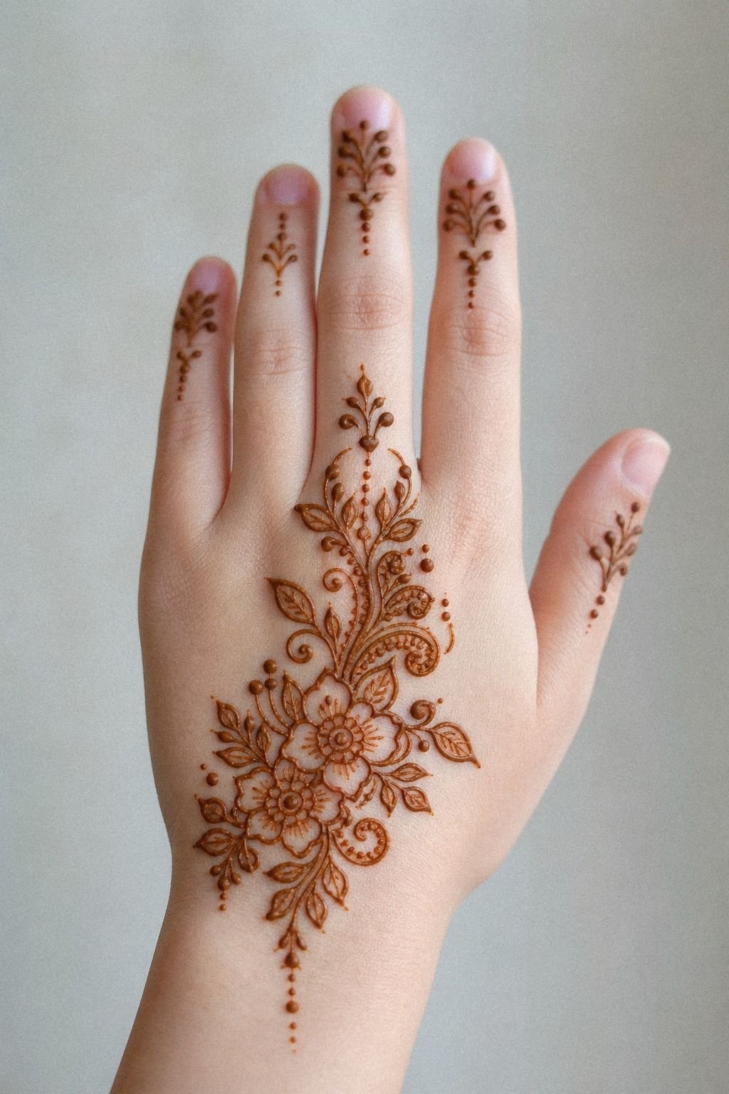
Instead of covering the whole palm with petals, I built one tight floral cluster off-center and let it play against the circle. That kept the hand feminine without turning soft and mushy. You want petals to look deliberate on a palm, not like wallpaper copied into a skin fold.
I used tiny rounded petals around one floral cluster so the shape stayed readable from a few feet away. But I refused to add extra filler leaves just because the skin was blank.
Blank isn’t bad. Blank is what keeps the flower crisp.
If you lean romantic but still want clean placement, the lighter arrangements in minimal mehendi designs are a smart place to compare density.

8I Added Leaf Trails Across The Palm
After the floral cluster, I needed motion. Leaf trails fixed that fast. I drew them on a diagonal so they crossed the palm gently and echoed the natural sweep from thumb mound to ring finger.
Straight across looked stiff on me, and curved too hard looked forced.
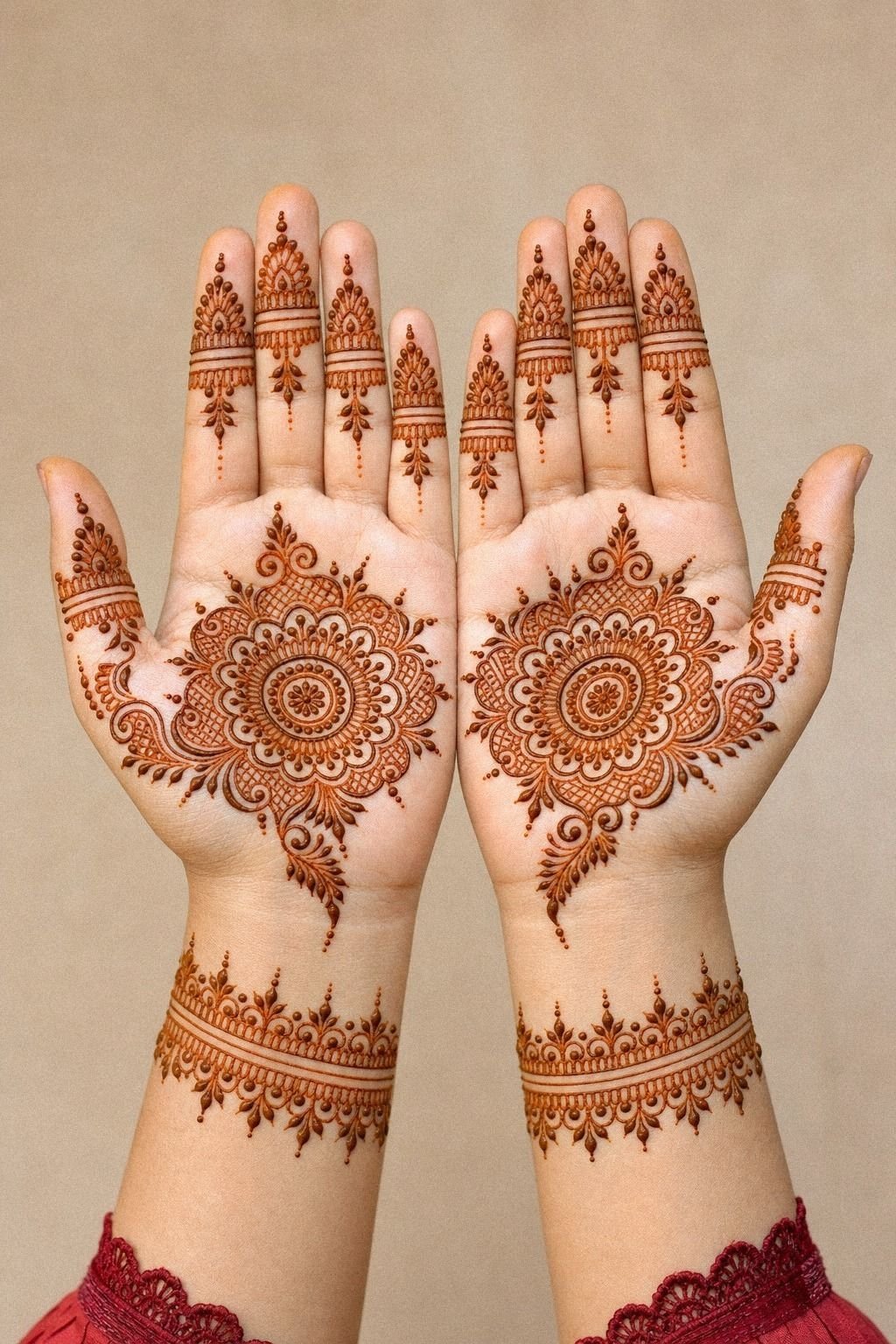
The little row of leaf trails kept both palms feeling related without making them twins. And that matters, because mirrored hands can get costume-y if every line matches exactly.
I prefer a sister layout, not a copy-paste pair. If you’re building both hands at once, 23 full hand mehndi designs to show your artist first shows how repetition works best when it shifts just a little.
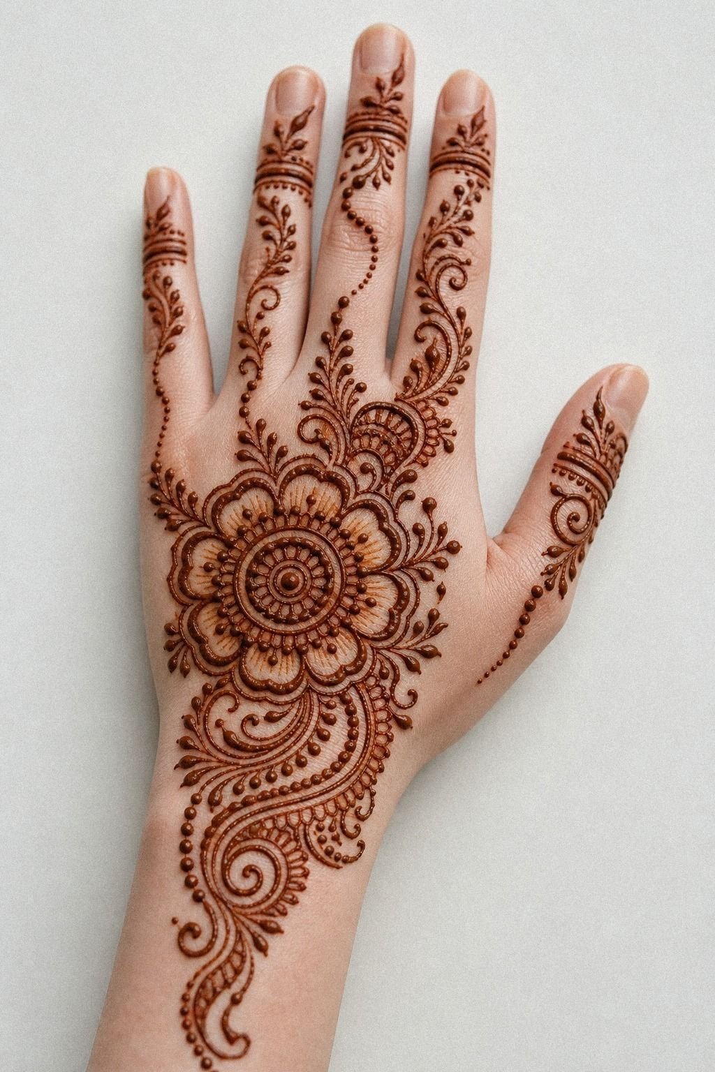
9I Framed Fingertips With Light Henna Caps
Fingertip caps can go heavy fast, so I kept mine translucent and narrow.
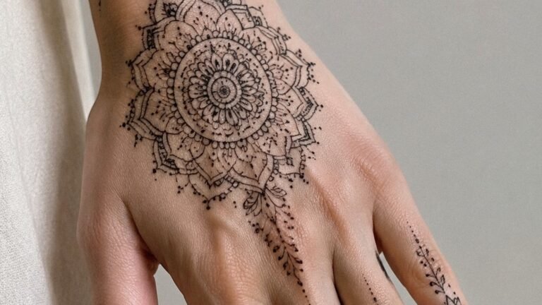
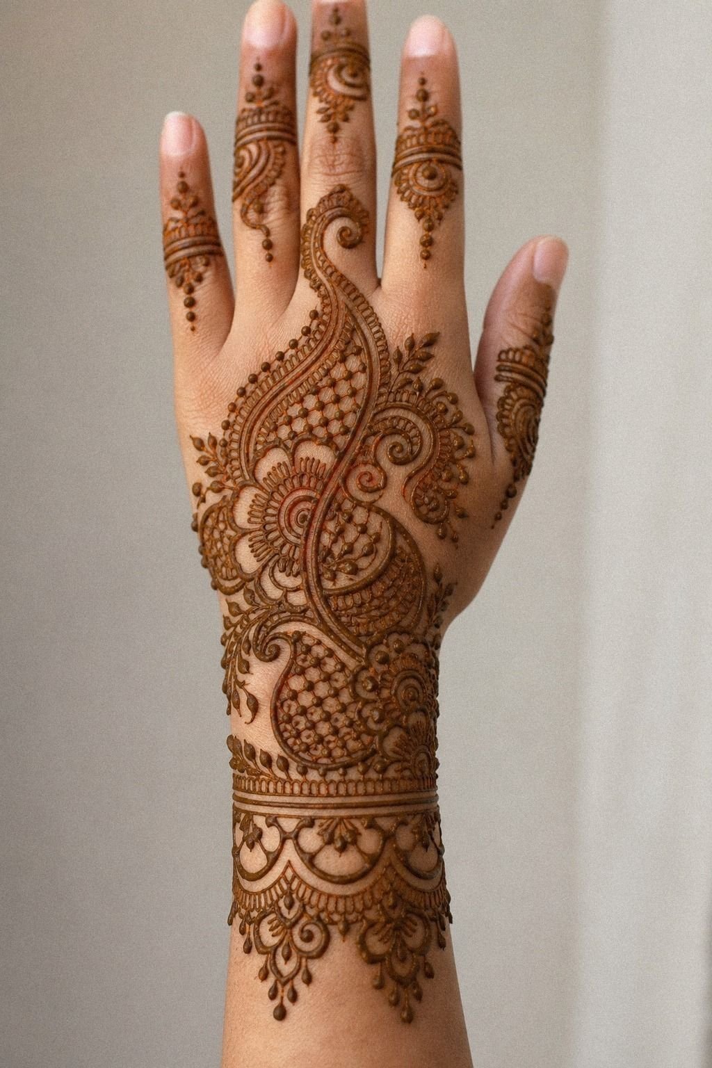
10I Tested A Unique Crescent Palm Motif
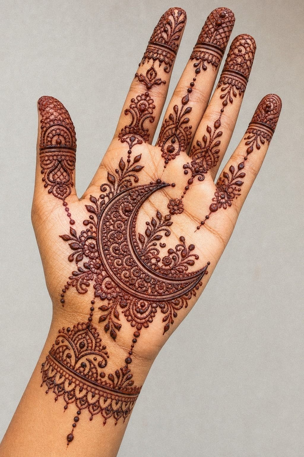
This was my wildcard, and I almost skipped it. A crescent shape tucked beside the center circle gave the layout attitude without making it louder.
You can use a crescent when a full second mandala feels too formal. It breaks symmetry just enough to make the design feel personal.
The clean bend of the crescent motif sat nicely against the main circle and gave the palm a little pull toward the thumb. But it only worked because I left the rest restrained.
Add too much detail around a crescent and it stops looking intentional. It starts looking patched.
For more oddball but still elegant shapes, front hand mehndi designs has a few layouts that prove asymmetry can stay soft.
11I Connected Finger Lines To The Mandala
Once the fingers and center were both working, I linked them. Not with thick bars.
With slim lines that felt like pathways coming home. You need this connection if you want the palm to read as one design instead of separate nice parts.
That join-up moment with the mandala links made everything click for me. But I kept each path slightly different in length so the hand didn’t look stamped out like a template.
Tiny variation is your friend here. If the linework on your references feels too uniform, compare it with 24 henna designs that reward a steady hand and you’ll notice the stronger ones have movement, not math.
12I Filled Gaps With Tiny Dotwork Chains
Here was my rule: fill only the gaps that looked accidental.
13I Kept The Front Palm Pattern Balanced
Balance didn’t mean perfect symmetry. It meant the left side of the palm felt as finished as the right side once the fingers opened.
I checked that by relaxing my hand, then spreading it, then relaxing again. Palm art changes a lot with movement, and if you don’t test that, you’ll miss the weird heavy spots.
I trusted one balanced layout rule the whole time: if a side felt louder, I removed detail before adding more somewhere else. But the minute I tried fixing imbalance with extra filler, the design got busy.
Less won. And if you’re choosing between bold coverage and a cleaner read, look at simple mehndi designs front hand easy and ask yourself which one you’d still like after staring at it for an hour.
14I Added One Bold Paisley Near Thumb
Paisley can look timeless or dated depending on how hard you lean into it. I used one stronger paisley near the thumb mound and let it act like a bold accent, not the whole story. That’s the move I’d recommend if you love traditional mehendi language but don’t want the palm feeling packed edge to edge.
The single paisley accent gave the design contrast and a little old-school richness. But I kept its outline wider than the tiny filler lines so it stayed readable after the stain deepened.
Tiny paisleys can turn to mush visually, fast. If you’re mixing modern minimal work with classic curves, stylish mehndi designs for front hand has a few cleaner ways to do it.
15I Checked Line Thickness Before Drying
This is where a clean design gets saved. Before the paste dried, I checked every major line for wobble, bulges, and accidental thick spots. You should do that while the paste is still forgiving.
Once it sets, a chunky line becomes the thing your eye keeps finding first.
I looked hardest at the line thickness around the center and finger starts, because that’s where uneven pull shows quickest. But I didn’t chase perfection with constant touch-ups.
Overworking soft paste makes edges ragged. Better one careful correction than five panicked ones. If line confidence is the part you’re training, 24 henna designs that reward a steady hand is full of layouts that tell on your technique in the best way.
16I Cleaned Smudges Around Finger Joints
Finger joints are messy little liars. A design can look perfect flat, then one bend presses paste sideways and suddenly the clean line near the knuckle looks fuzzy. I kept cotton swabs nearby and cleaned those spots early instead of pretending they’d disappear on their own.
A quick pass around the finger joints brought the whole design back into focus. But I only cleaned the smudge itself, not the line beside it, because once you start scraping too close you can thin out good work. Steady hand.
Tiny fix. Done! If you want cleaner knuckle transitions to study, back hand mehndi designs helps because those joint breaks are easier to see from that angle.
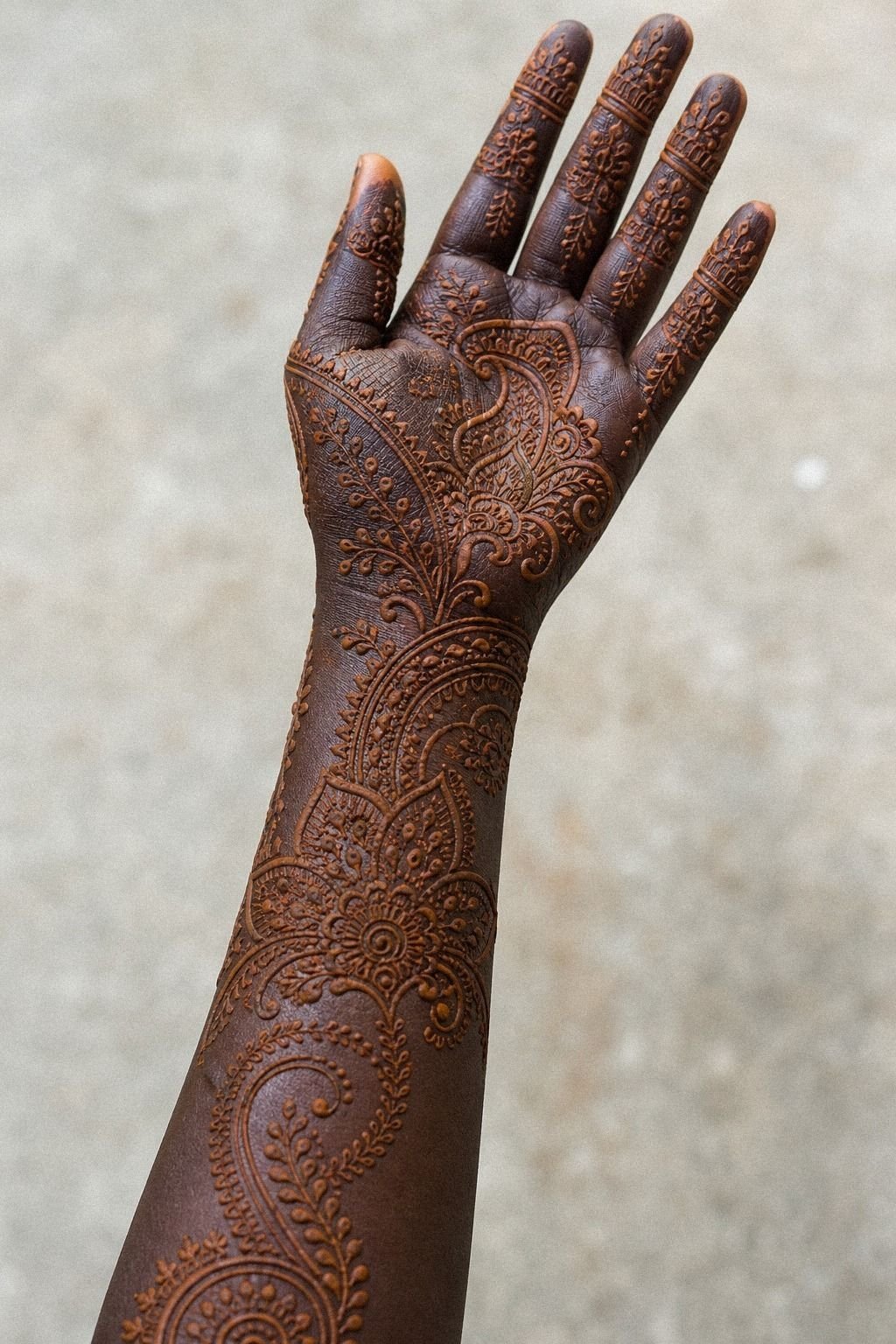
17I Let The Palm Stain Develop Slowly
Fresh henna can fool you. Right after removal, the stain looks bright orange and a little underwhelming. Then it deepens.
I left mine alone, kept water off it for the first stretch, and let oxidation do its thing instead of judging the color too early.
The next day, the reddish brown stain looked richer and cleaner, especially where the thicker lines sat on warmer skin. But I still knew this was temporary art, not aftercare-free magic.
Sun, hand washing, and friction start fading it fast. That’s also why palm tattoos heal slower and feel spicier than forearm work. If you want to test a future tattoo layout first, henna buys you a low-commitment preview that minimal mehendi designs can help refine.
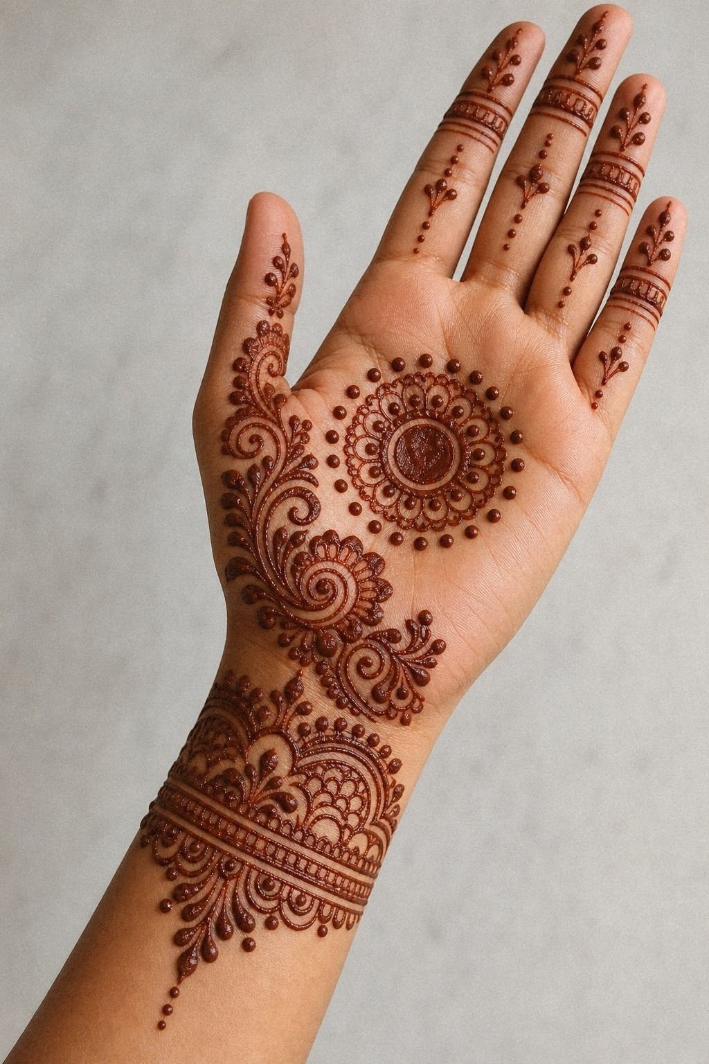
18I Photographed The Design With Open Fingers
Photos tell the truth your mirror won’t. I shot the design with my fingers open, then half relaxed, then angled slightly sideways. You should do all three, because a palm pattern that looks clean only in one pose isn’t really clean yet.
The best image came when the open finger pose showed the center motif, the fingertip caps, and the wrist gap all at once. But a tighter, closed pose hid the flow and made the lines look denser than they were.
That was useful! It showed me which version would read best in a tattoo consult photo.
For more reference-friendly layouts, 23 full hand mehndi designs to show your artist first is worth saving.
19I Picked The Cleanest Palm Mehendi Finish
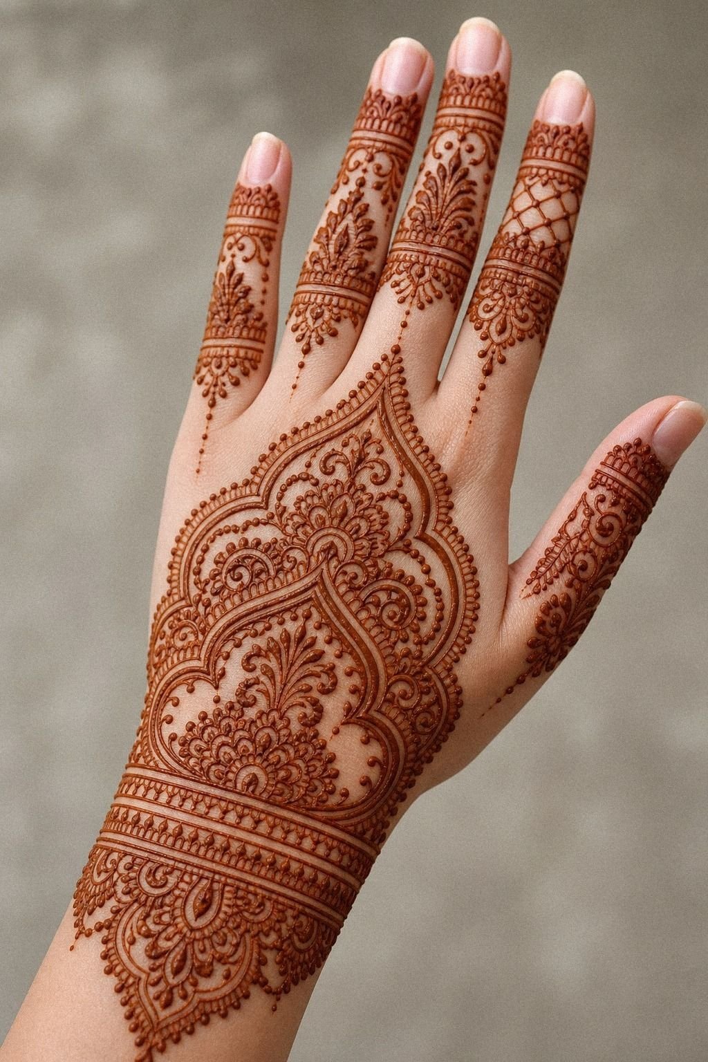
At the end, I had a few variations on my hand and one clear winner. The cleanest finish kept the center circle, the thumb vine, light fingertip caps, and just enough dotwork to stitch it together.
No extra filler. No panic leaves.
No heavy wrist drop.
That final palm finish worked because every part had a job and nothing was there just to fill skin. But the biggest lesson for you might be this: the design you love in a screenshot isn’t always the one that suits your actual palm.
Try the cleaner version first. It reads better, it photographs better, and if you ever turn it into permanent ink, your artist has a much stronger map to build from.
How much it cost
My temporary test cost me less than booking permanent hand work, but the useful numbers for you are the tattoo ones. If you take a clean palm mehendi concept to an artist as real tattoo reference, a US shop minimum often starts around $50 to $100, while many artists charge about $100 to $250 an hour. Palm placement usually needs more intention than people expect because the skin is high movement, high friction, and a little spicy.
I would budget for touch-up conversations too if you’re putting permanent ink on the hand. But I wouldn’t rush straight from henna test to tattoo appointment without checking how the layout reads after movement, photos, and one normal day using your hands.
The Open Skin Rule
Trying mehendi first taught me something I wish more first-timers heard. Palm art looks best when you design for movement, not for a frozen screenshot. I see people fall for tiny details because the close-up is pretty, then they spread their fingers and the whole thing collapses into noise.
On skin that bends all day, clarity is the flex.
But henna is underrated as tattoo planning. It isn’t the same as ink, and I wouldn’t pretend otherwise.
The stain sits differently, the finish is softer, and it fades instead of healing. Still, it shows you placement logic in real time. You learn whether the center is too big, whether the thumb edge needs less, whether fingertip caps steal attention, and whether your open skin is doing enough work.
The Palm Flow Test
I wouldn’t tell you henna predicts every tattoo result, because it doesn’t. Palm tattoos heal differently, especially on high-wear skin, and very fine lines can widen over time.
But this test gave me a decision framework I trust now, and you can steal it. Start with one anchor. Let open skin breathe.
Make every line earn its place.
And that’s where most people lose the clean look. They see a blank patch and rush to fix it.
I did that too on an earlier version, and it got busy in seconds. The extra dots weren’t awful. The extra leaf wasn’t awful.
Put together, though, they pulled attention away from the center and made the whole palm feel noisier. Palm work punishes overexplaining.
The part that worked was editing harder than felt comfortable. I kept checking the design in three positions: fingers open, half relaxed, and slightly curled.
If a line only looked good in one pose, I cut it. If a detail disappeared once my palm moved, I cut it.
If a flourish made the center weaker, I cut it. You should be that ruthless, especially if the end goal is permanent ink.
But here’s the payoff. Once the unnecessary stuff is gone, the hand starts reading clean in motion, in photos, and at normal conversational distance.
That’s the version worth taking to an artist. Not the fussy screenshot version.
The one that still looks solid after you wash your hands, answer texts, and forget to baby it for a minute. That’s the one with real staying power!
The Questions I Get Asked Most
How much does a Aesthetic Mehendi Designs For Palm Hand usually cost?
About $50 to $100 minimum, and many tattooers charge about $100 to $250 an hour in the US.
– Small palm concept, shop minimum – More detail, longer session – Hand placement, touch-up talk worth having
Are Aesthetic Mehendi Designs For Palm Hand a good idea for a first tattoo?
Yes, if you keep the design clean and readable and understand that palm or hand-adjacent work can be higher maintenance.
– Simpler linework, clearer aging – Henna test first, smart move – Better artist fit, better outcome
If you want gentler reference before you commit, I like mehendi designs for hands simple.
How do I choose a tattoo artist for Aesthetic Mehendi Designs For Palm Hand?
Pick someone with crispy healed linework in their portfolio, not just fresh photos under bright light.
– Healed results, not only day-one shots – Clean studio, clear aftercare – Fine line skill, steady hand confidence
For reference styles to show at a consult, 23 full hand mehndi designs to show your artist first helps narrow the conversation.
How much do Aesthetic Mehendi Designs For Palm Hand hurt?
Hand and palm work is usually spicier than forearm work because the skin is thin, mobile, and busy.
– Lines, sharper feeling – Shading, dull burn – Palms and fingers, higher pain than outer arm or thigh
How long does a Aesthetic Mehendi Designs For Palm Hand take to heal?
Surface healing is usually about 2 to 3 weeks, and the full settle can take 2 to 3 months.
– Gentle wash, unscented soap – Thin moisturizer, not greasy suffocation – No pools, hard gym friction, or picking
What’s the best placement for Aesthetic Mehendi Designs For Palm Hand?
For longevity, I’d move the look to the outer forearm or upper hand if you want cleaner aging than a true palm tattoo.
– Palm, bold but high-wear – Outer forearm, easier healing – Upper hand, visible but more stable than the center palm
The One I’d Start With, The Clean Circle Rule
If I had to pick one, I’d start with the simple center palm mandala. It gives your whole layout a spine, and without that anchor the rest starts drifting.
Save that version first. You will know fast whether the design has real staying power.