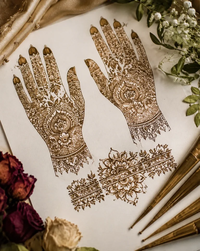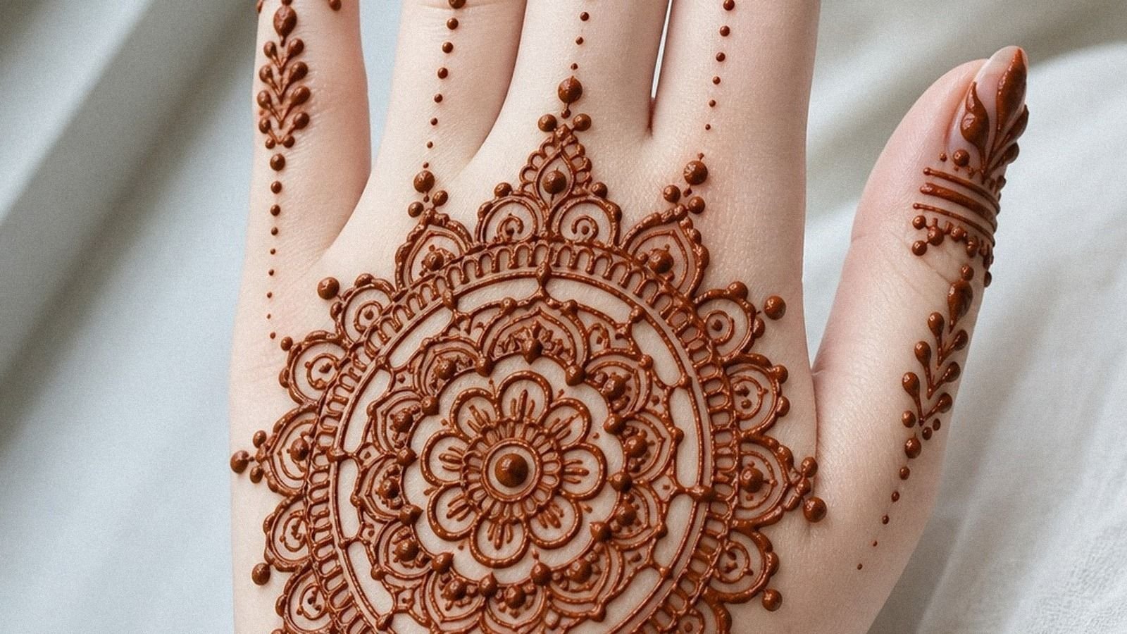
I almost talked myself out of my first only palm mehndi design because I thought palm work would blur fast and look busy. I was wrong! When the lines are crisp, the spacing is honest, and the mehndi artist doesn’t cram every gap, these designs stay readable as the stain develops. For anyone chasing something pretty, elegant, low-pressure, and worth saving to a mehndi board, this is where I’d start.
- Start with a Simple Center Palm Mandala
- Why does a Fine Line Palm Grid stay so clean?
- Dotwork over filler for an airy palm
- Lean into Bold Paisley Movement
- Open skin breaks vs packed palms
- Lotus center with calm symmetry
- Let Arabic Vine flow across the palm
- Jaipur floral clusters that stay airy
- Mughal geometry, soft skin flow
- Link the fingertips without overworking them
- Crescent moon or full filler?
- Bridal finish, clean hierarchy
1Start with a Simple Center Palm Mandala
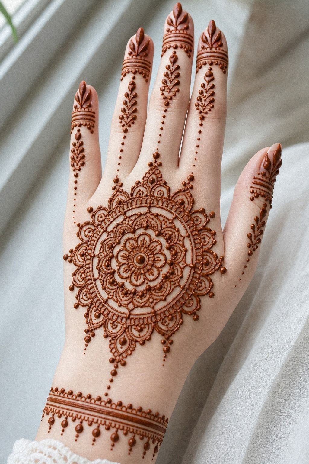
[IMAGE: center palm mandala with open rings, slim finger trails, and clean negative spacing on medium warm skin]
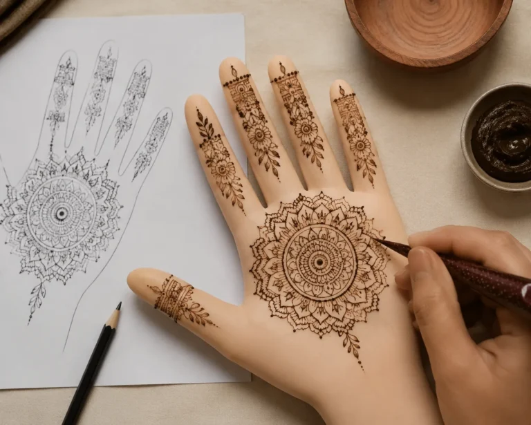
Start with a centered mandala if you want the cleanest entry point into only palm mehndi design. A henna cone circle in the middle of the palm gives the eye one anchor, and that matters when you’re trying to keep a detailed style from turning into visual soup. I like this on fair, cool skin because the reddish-brown stain reads sharp without needing heavy fill.
Keep the outer rings open. Leave a little clearance between each petal so the shape still reads at a glance after the stain deepens over 24 to 48 hours. That open spacing adds real visual payoff because the pattern still reads from a few feet away.
If you’re choosing between a packed motif and a cleaner one, I’d spend your money on clean application, not extra filler. If you love the vibe of very simple mehndi designs, this version feels polished instead of plain.
The clean-center rule
One focal medallion. Slim finger trails.
No extra filler just because the palm feels empty. Let the paste dry fully, then protect the flakes rather than scrubbing them away.
The design will look more understated as the stain settles into a warm brown tone.
2Why does a Fine Line Palm Grid stay so clean?
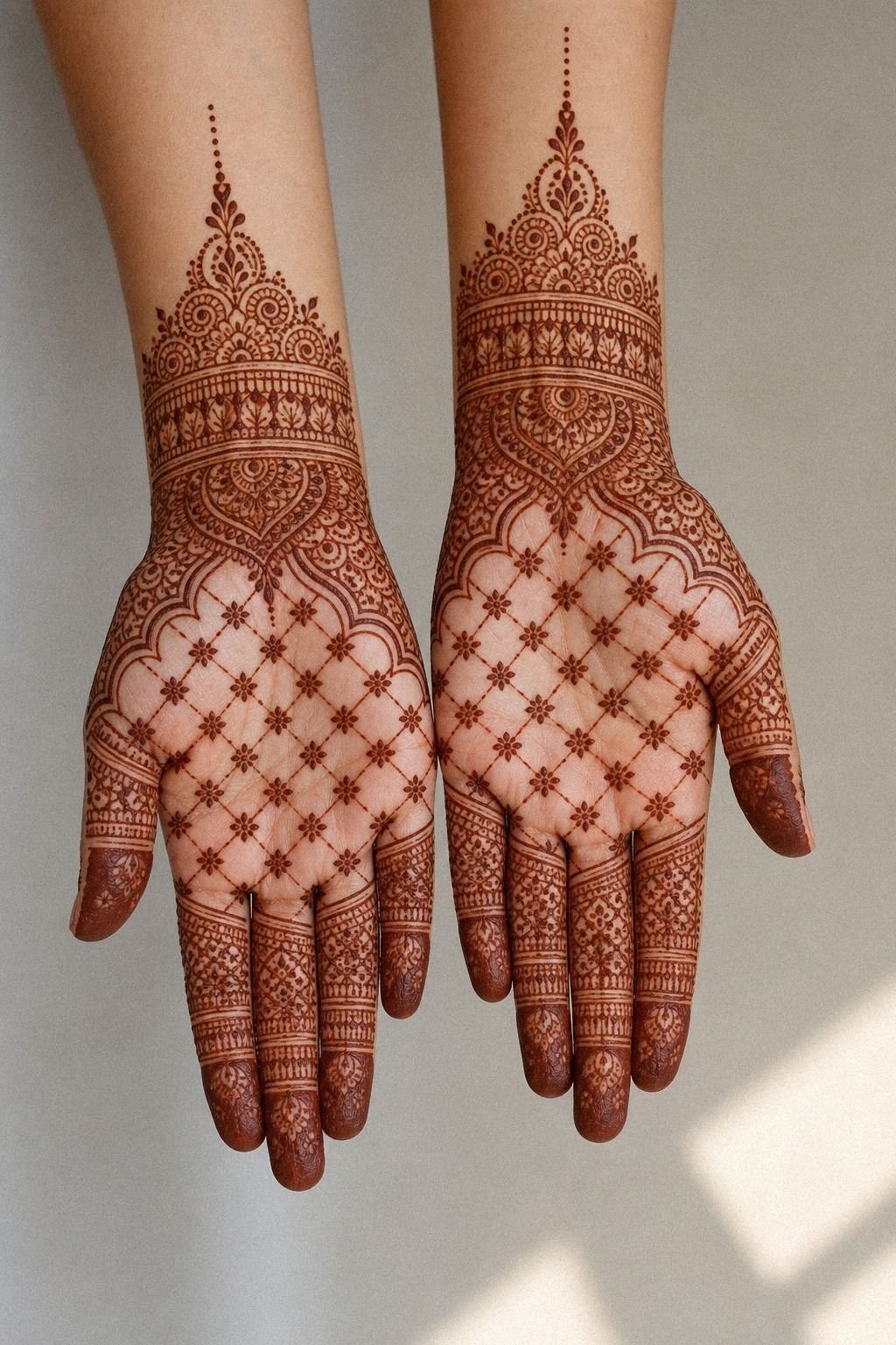
[IMAGE: fine line palm grid with even squares, soft wrist band, and tiny accents on olive skin]
Use a grid when you want symmetry without that overworked bridal look. A tidy fine line grid gives you structure fast, and it keeps the whole palm looking intentional, sleek, and never crowded. It also gives good value for anyone who loves order but doesn’t want a dense application.
The key is keeping every lane the same width. If one side tightens up, your eye catches it immediately. On medium skin, a light stain with crisp spacing looks striking even when the application cost stays pretty low.
This is also a smart starter choice if you want a clean result without paying for hours of dense detail. The cone work stays focused, the paste dries in a manageable pattern, and the result feels sleek without chasing unnecessary complexity.
3Dotwork over filler for an airy palm
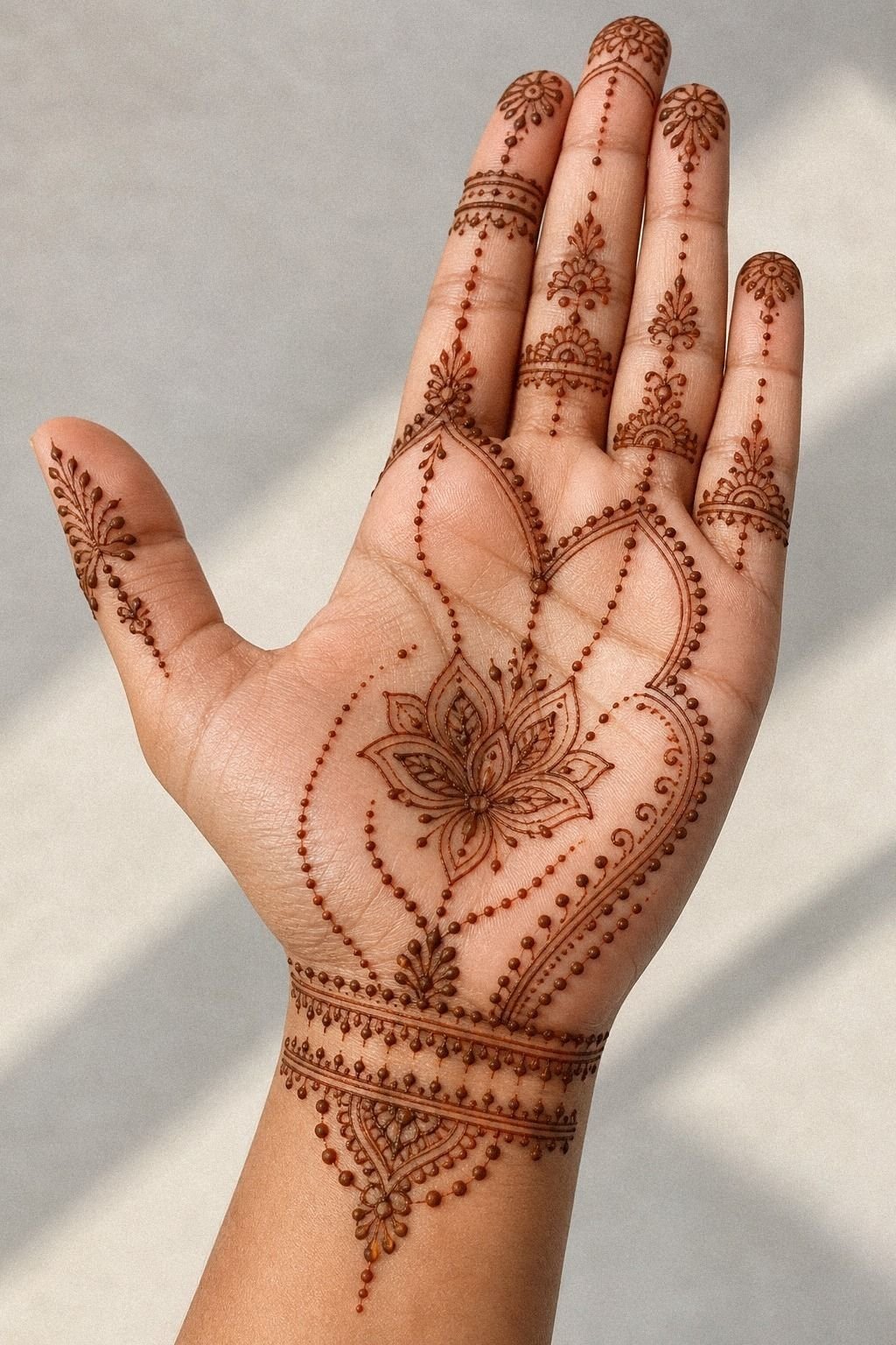
[IMAGE: dotwork palm pattern with tiny arcs, open base cluster, and soft wrist fade on olive skin]
Try dotwork if you want something airy that still feels finished. A palm pattern built from tiny dots, short arcs, and a little wrist extension can look soft on medium olive skin, but soft doesn’t mean weak. The clean version can use eucalyptus oil in the paste formula, while a lemon-sugar finish helps protect the dried surface and supports an even stain.
I’d keep the densest cluster near the base of the palm, then let the dots taper toward the wrist. That base-palm fade matters. It gives the design movement, and it stops the whole thing from looking stamped on.
And yes, this style is a smart first-timer move because the spacing is generous and your eye can track it fast. If you collect mehndi references, dotwork also teaches a strong contrast lesson: clarity beats fuss. Tato design references is a useful scroll if you want to see how simple marks can still feel intentional.
4Lean into Bold Paisley Movement
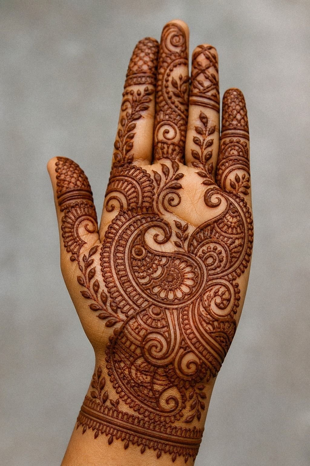
[IMAGE: paisley palm mehndi with one bold sweep, open side lanes, and rich stain on brown skin]
Go with paisley when you want more movement and a little more attitude. A single paisley sweep gives your palm a dramatic, bold curve, and it reads fast without feeling stiff.
I’d keep one side heavier and the other side quieter. That asymmetrical balance is what makes paisley feel graceful instead of busy. If you stuff every gap with mini leaves and dots, the whole thing loses its rhythm and starts looking muddy.
For a special occasion, this one gives solid reference payoff because it teaches flow. You can see what your hand likes before arranging a larger mehndi design, and it works as a low-pressure way to test scale before committing to a full bridal pattern.
5Open skin breaks vs packed palms
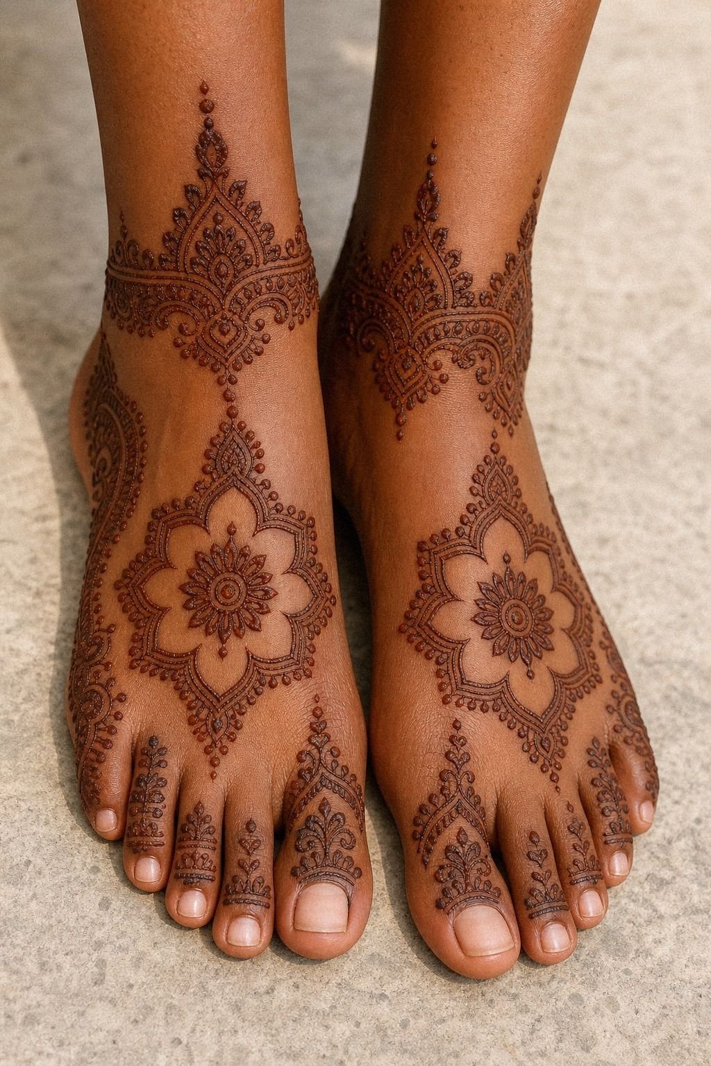
[IMAGE: open-lane palm layout with dark outer frame and one clean center lane on deep brown skin]
Skip the urge to fill every inch. Open skin is what makes a palm design breathe, especially on deeper brown skin where the contrast between untouched skin and dark BAQ henna looks extra sharp.
I see people panic when there is open skin in the middle of a design. Don’t.
Empty sections are not unfinished sections.
The best version of this layout uses bold outer framing and then leaves quiet lanes through the center. That open lane is the part your eye remembers. It also helps the design stay legible once the stain peaks on the first or second day.
Why pay for detail nobody can read later? That’s low return work, even if the mehndi artist is talented.
If you want to borrow this layout for another hand design, move the composition toward the outer edge of the palm or keep it as a front-hand accent. Simple mehndi designs front hand easy gives you more examples of how open skin keeps the pattern readable.
The open-lane method
One framed edge. One quiet lane. A few soft accents.
Then stop. The result feels minimal while still giving the palm a clear focal point.
6Lotus center with calm symmetry
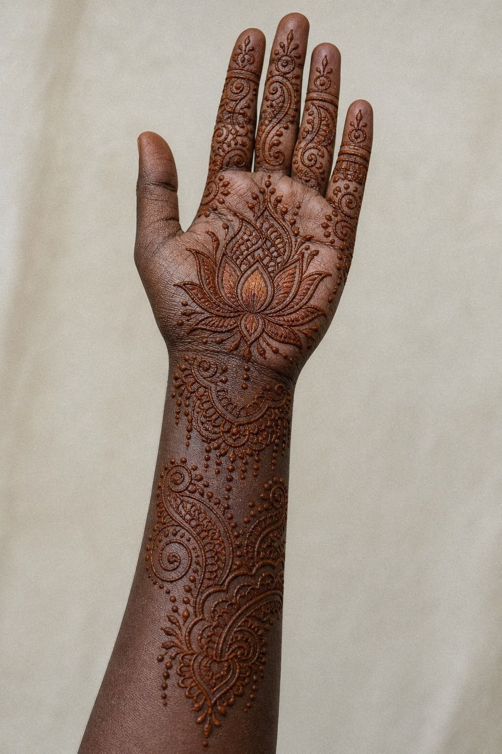
[IMAGE: lotus center motif on the palm with light petals, soft finger echoes, and balanced spacing]
Anchor the whole design with a lotus if you want something symbolic but still clean. A centered lotus motif feels soft, feminine, and meaningful, especially when the petals stay broad, graceful, and the detailing stays light.
I’d keep the lotus larger than you think you need. Tiny petals stacked too close together become difficult to read once the paste flakes and the stain deepens. Broad petals give you that graceful, polished finish you were probably pinning in the first place, and the extra size adds real value.
This is also one of the better smart picks if you want symbolism without a cluttered layout. You get meaning, shape, and a gentle focal point all at once.
7Let Arabic Vine flow across the palm
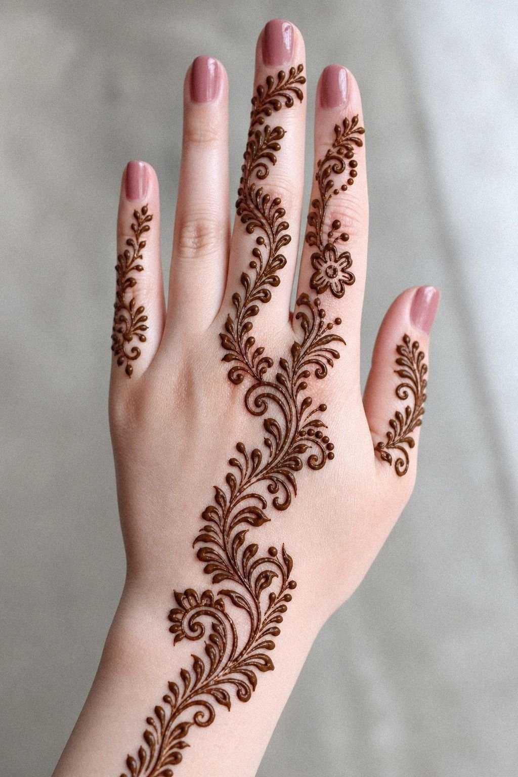
[IMAGE: Arabic vine palm design with diagonal leaf flow, light fingertips, and slim raised lines]
Let the vine travel diagonally if you want motion without visual noise. Arabic-style vine work looks best when the leaves sweep across the hand with clean fresh-paste lines that stay slightly raised while drying. On fair cool-pink skin, that diagonal sweep reads elegant fast, even before the full stain develops.
I’d start near the wrist, cross the palm, and finish with lighter finger accents rather than heavy fingertip caps. That diagonal flow gives the design direction. And direction matters more than detail here.
This one is also a solid bridge between classic and modern mehndi references because vine work teaches flow. You want it following the natural movement of the hand, not cutting awkwardly across it. If you’re collecting reference angles before an appointment, mehndi design website ideas can help you think about composition, and the layout is worth it if you want motion without a heavy look.
8Jaipur floral clusters that stay airy
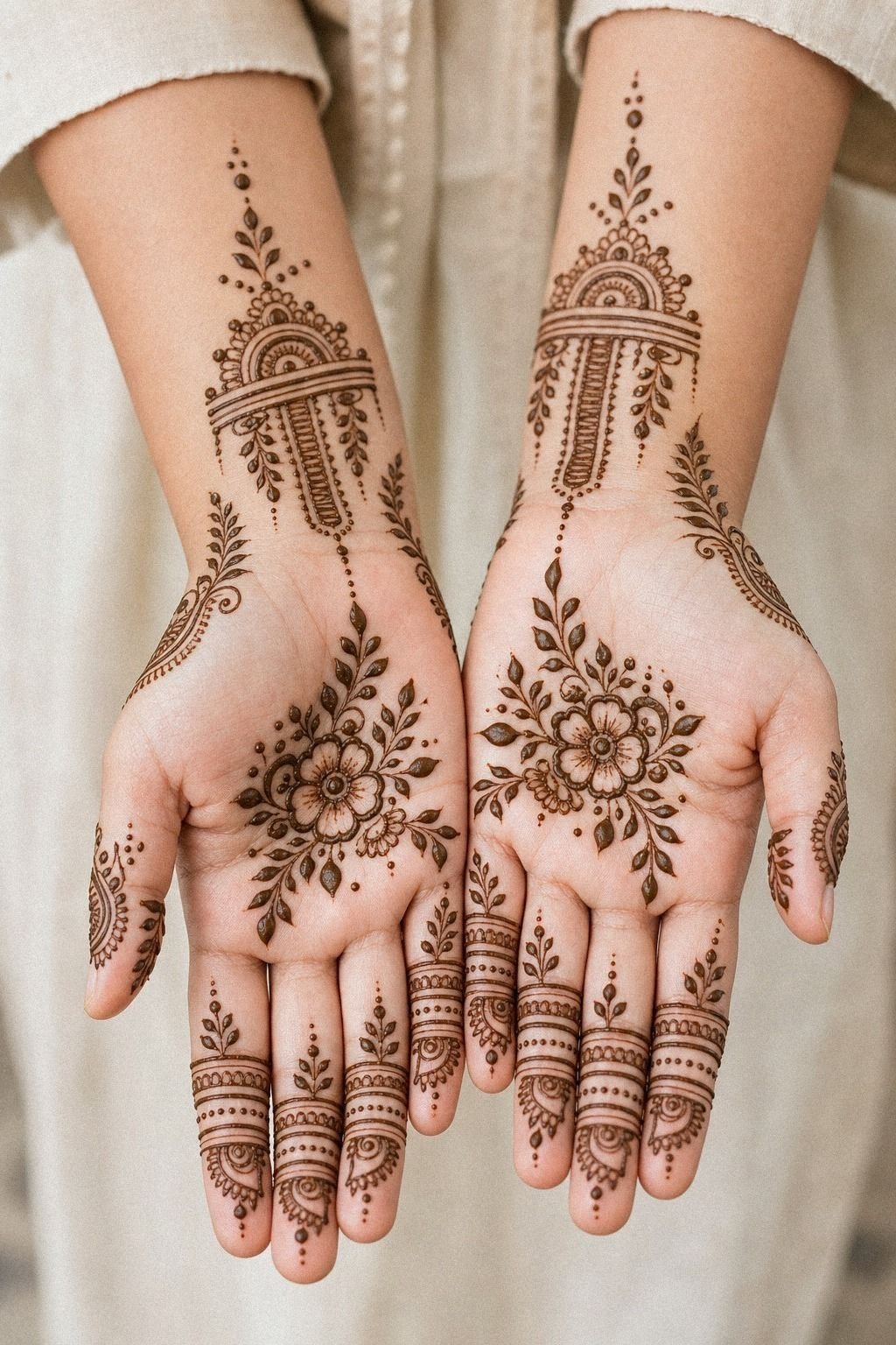
[IMAGE: tiny floral mehndi cluster with round petals, dot trails, and soft open spacing on ivory skin]
Cluster a few tiny flowers instead of building one giant bloom if you want a sweeter, lighter only palm mehndi design. Small florals can look adorable on medium warm ivory skin when the artist uses a smooth sifted henna cone and keeps the petals round, open, and evenly laid out.
This is the part people mess up. They go too tiny, and then every flower starts to blur into one soft blob as the stain develops.
Give each bloom a little petal clearance. A flower, a dot trail, a small leaf.
Then stop. That extra clearance is what keeps it sweet and romantic!
If you want the design to stay readable while the color fades, don’t stack six mini blooms side by side with hair-thin outlines. Tiny detail can turn to soup, even with temporary body art.
That simpler approach gives you better value than a packed floral blur. Very simple mehndi designs pairs well with this mood if you want a softer starting point.
9Mughal geometry, soft skin flow
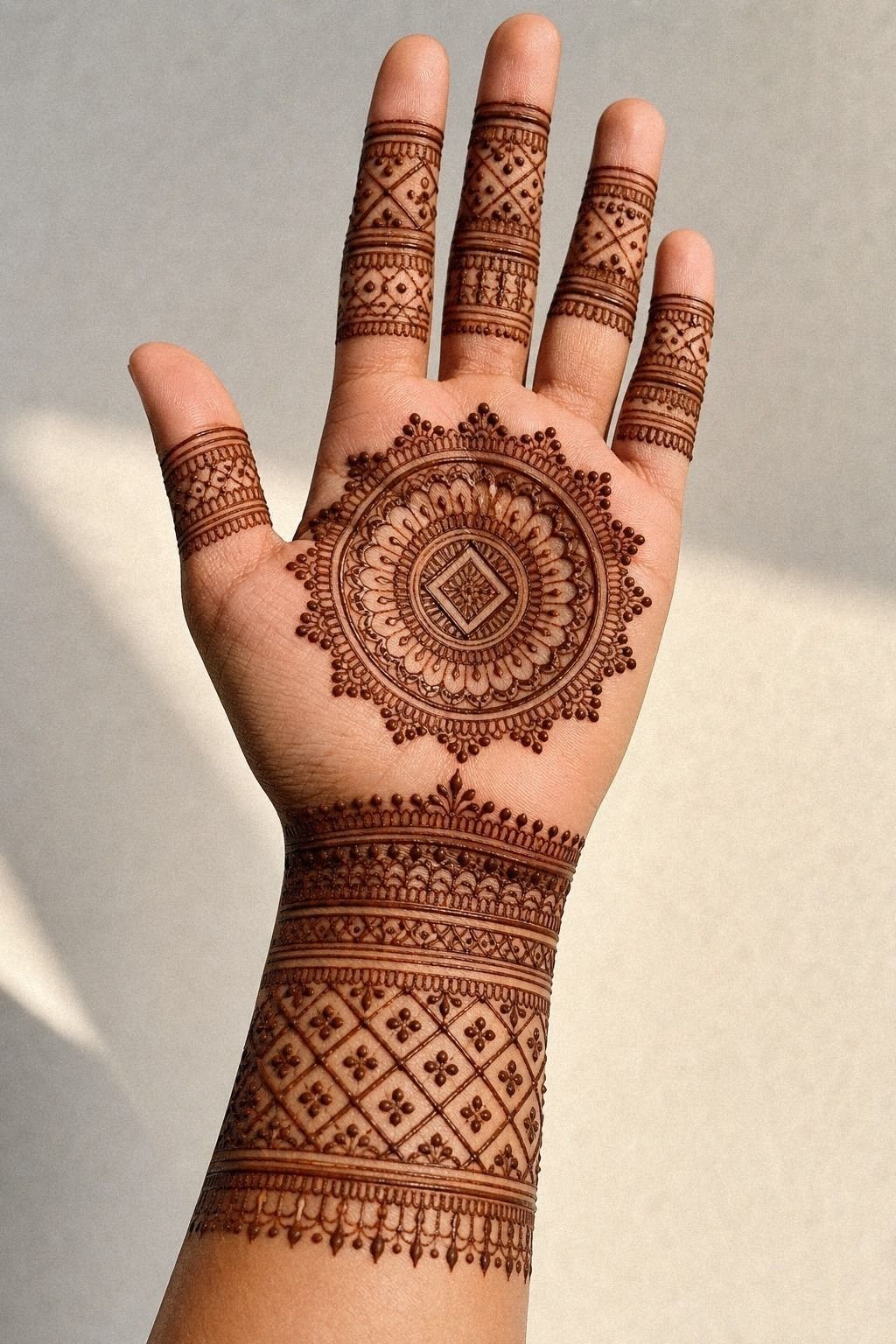
[IMAGE: geometric palm linework with diamonds, measured bands, and open margins on olive skin]
Build with geometry when you want the cleanest possible control. Straight lines, tiny diamonds, and measured wrist bands can look incredible on medium olive skin if the artist uses well-mixed henna paste and keeps the symmetry honest.
Geometry is unforgiving. A shaky line shows immediately.
I tell people to keep one geometric zone bold and let the rest stay lighter. That measured rhythm gives the pattern shape. If every triangle gets filled, every band gets doubled, and every corner gets another corner, the design loses air and starts feeling stiff.
This style gives great design payoff because you learn fast whether you like strict structure on your own skin. If you like precise patterning, realistic palm tree guide is useful for seeing how structure and spacing keep detail readable.
The crisp-grid test
One sharp framework. Soft open skin around it. That’s the difference between clear lines and a pattern that feels boxed in.
10Link the fingertips without overworking them
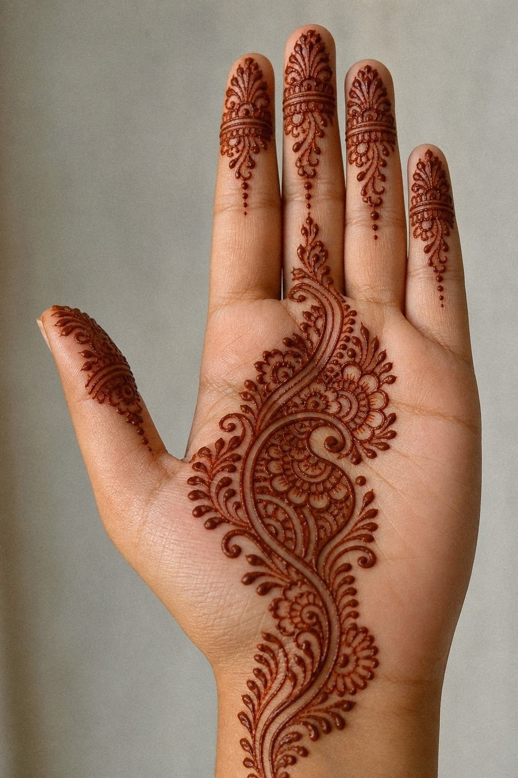
[IMAGE: fingertip linked trail with dot chains, slim scallops, and a weighted center path on tan skin]
Link the fingertips back into the palm if you want the whole hand to feel connected. This trail style works best on golden tan skin when the artist uses a fresh lemon-sugar seal to keep the paste flakes in place and support a rich stain. I love how it makes each finger feel finished without having to cover the whole hand.
The move is giving each finger its own finger rhythm. One dot chain.
One leaf chain. One tiny scallop. Then tie those strands into a central palm trail that has a little more weight.
But don’t make every fingertip solid. Heavy caps plus a busy palm is where this layout starts to look chewed up. For more front-hand inspiration with clean line breaks, stylish mehndi designs for front hand is a good next save.
11Crescent moon or full filler?
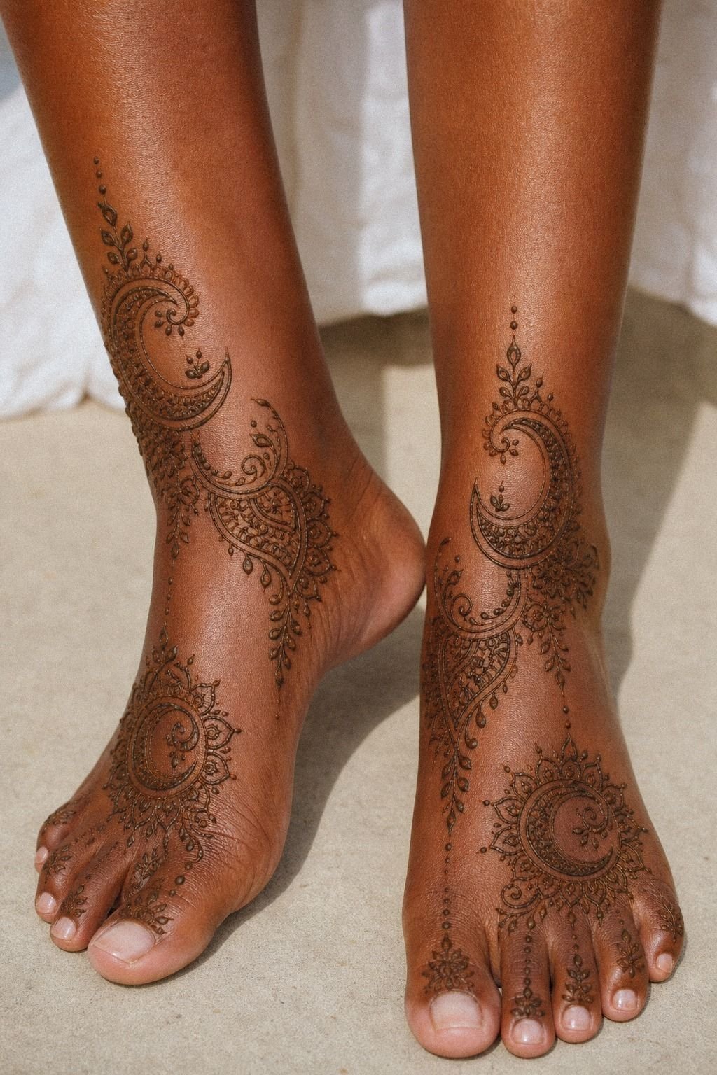
[IMAGE: crescent moon palm accent with open surrounding skin and tiny stars on cool medium skin]
Use a crescent moon as the accent if you want something symbolic that still feels light on skin. A small crescent moon motif gives you a dreamy, delicate, ethereal focal point without forcing the whole palm into heavy coverage.
I’d pair it with two or three supporting marks, not twenty. A few dots, a tiny star, maybe a slim curve near the wrist.
That’s enough. The restraint is what makes it feel delicate instead of childish.
If you’re watching your spend, this is one of the best starter layouts because the application time stays shorter and the result still feels intentional. It’s simple, but it doesn’t look cheap.
12Bridal finish, clean hierarchy
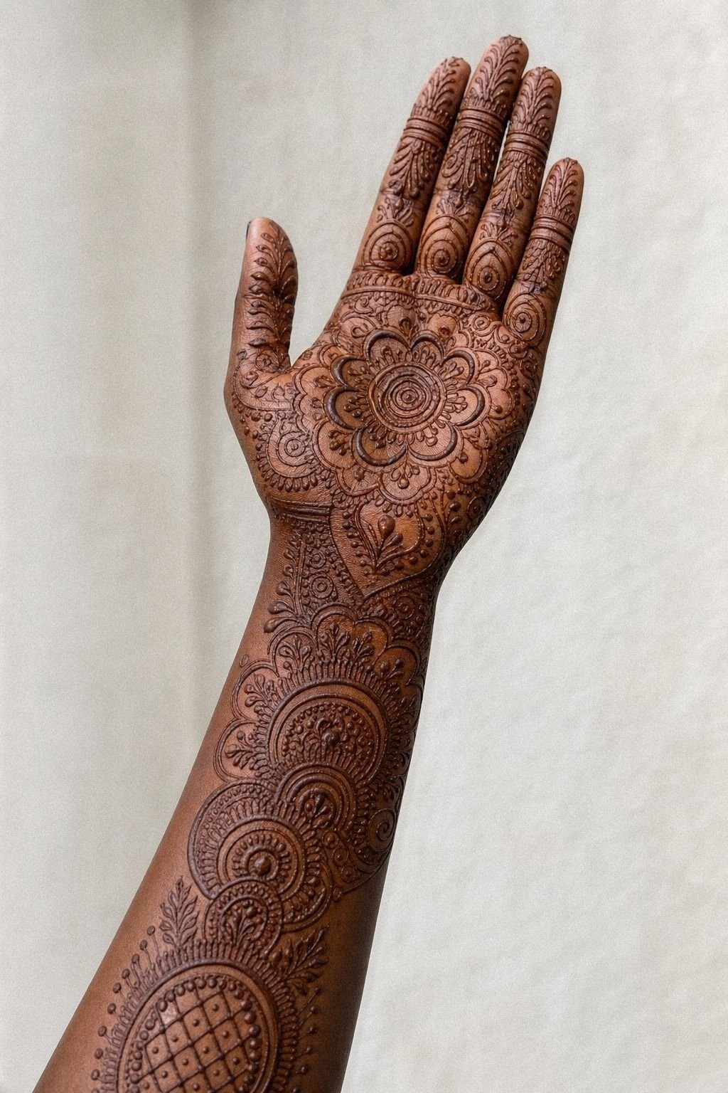
[IMAGE: clean bridal palm mehndi with one dominant motif, two support bands, and organized finger transitions]
Choose a bridal style only if the mehndi artist knows how to keep dense work organized. A bridal palm design on deep ebony skin can look vibrant when the fresh henna paste is well prepared, the motifs are balanced from wrist to hand, and the darkest zones are placed with intention.
Bridal doesn’t have to mean overdone. It just needs hierarchy.
That cleaner structure looks rich and luxurious!
I’d ask for one dominant center motif, two supporting bands, and clean finger transitions instead of nonstop filler from wrist to fingertip. That structure is what makes dense work read ornate rather than messy.
And this is also the design that benefits most from patience. Patience pays off!
Let the paste dry, avoid smearing, and leave the dried flakes on for several hours so the stain can develop properly. After removal, limit water, pool time, and heavy friction while the color deepens through the second day.
If you want more dense ornamental reference before arranging the design, trendy front hand ideas in this mehndi guide can help you sort clean bridal work from clutter. And if you want a simpler counterpoint, front hand easy designs here are useful for comparison.
Why I’d still choose clean palm linework over louder trends
[IMAGE: palm mehndi reference sheet showing clean motifs, open lanes, and stain-development notes on medium skin]
I have watched a lot of people chase detail for detail’s sake, and it almost always goes the same way. People save a gorgeous reference, zoom all the way in, and start asking for more petals, more dots, more chains, more everything. Then the finished design loses the one thing that made the reference good in the first place, which was clarity.
Clean work reads fast. The eye knows where to land. And when the stain begins to soften after a week or two, that clarity is where the real payoff lives.
Here is the framework I use with clients and friends. First, pick the hero. That might be a mandala, a lotus, a paisley, or a moon.
Second, decide where the quiet should live. Usually that’s one open lane through the palm, a lighter wrist, or fingers that are marked but not drowned. Third, scale the detail to the skin. If the lines are too tight, they fight each other.
If the pattern is too tiny, it stops reading clean once the stain darkens. Bigger isn’t always better, but smarter spacing usually is.
And this is where palm mehndi differs from permanent body art. Mehndi lets you play with finer filigree because it is temporary.
The paste dries, the skin develops a reddish-brown stain, the color darkens around the second day, and the design gradually fades over one to three weeks. Real talk: if you want the look for an event without a long-term commitment, this is exactly where mehndi shines.
I also think people get weirdly shy about talking money here, and you shouldn’t. A mehndi appointment has genuine planning upside.
You can figure out whether the motif flatters your skin tone, whether the scale feels right, and whether the flow works with your actual hand before arranging a more elaborate bridal design. That’s smart.
That’s not indecisive. It also protects your budget from expensive guesswork.
Here is the honest part. The prettiest palm reference on Pinterest is not always the best design for you.
If the pattern only looks good when you’re zoomed way in, it’s already losing. I’d rather see you choose one bold motif with clean lanes and solid contrast than force a hyper-detailed bridal pattern onto a palm that needs more breathing room. Bold will hold visually.
Clean spacing stays readable. And yes, the simpler version is usually the smarter choice.
The Questions Worth Answering First
[IMAGE: mehndi aftercare and placement reference with palm stain fade, event option, and simple linework notes]
How much does a Only Palm Mehndi Design usually cost?
For a simple only palm mehndi design, I would expect roughly $10 to $35 from a local mehndi artist. Detailed work often lands around $35 to $100, while bridal applications can cost more. The final price depends on coverage, paste quality, artist experience, and whether you choose one palm or both.
Is Only Palm Mehndi Design a good idea for a first mehndi application?
Yes, this style can be a great first application if you want something clean and readable. I’d start with a center mandala, paisley, or open floral design, then let the paste dry for one to two hours. You get a strong visual result without committing to dense coverage across the entire hand.
How do I choose a mehndi artist for Only Palm Mehndi Design?
Look for healed-looking stain photos that show crisp lines, smooth symmetry, and confident spacing. You also want an artist who uses fresh, clearly labeled henna paste and explains drying, removal, and aftercare. This mehndi design reference guide can help you organize inspiration before your appointment.
Does Only Palm Mehndi Design hurt?
No. Properly prepared henna paste should sit on the skin without pain. You may notice mild tightness as the paste dries, and anyone with sensitive skin should request a small patch test first.
Stop immediately if you feel burning, itching, or swelling, especially if the product contains unknown additives.
How long does a Only Palm Mehndi Design take to dry?
The paste usually needs about 1 to 2 hours to dry, depending on the design thickness and weather. After it flakes off, the stain may look orange at first, then deepen through the second day. Avoid soaking the hand immediately afterward so the color has time to develop.
What’s the best placement for Only Palm Mehndi Design?
For temporary mehndi, the center palm is usually the smartest call because you get the full visual impact and can enjoy the stain for one to three weeks. Keep the design open around the creases if you want it to stay readable as it fades. If you’re still deciding, these front hand examples help a lot.
Where I’d Start First
[IMAGE: center palm mandala hero shot with bold focal point, open lanes, and crisp fingertip trails]
If I’d pick one, I’d start with the center palm mandala. It gives you one clear landing point, clean spacing, and the best visual payoff for the money. Pin that first and compare it with very simple mehndi designs.